Pantone Color Matching Guide For Custom Patches | Thread & PVC Color Calibration & Avoid Color Shift
Unexpected color difference between confirmed design and final finished patches is the most frequent reason for order disputes between buyers and manufacturers. Digital screen color varies greatly under different display brightness, while embroidery thread and PVC raw pigment have inherent material color limitations, leading to visible shade shift without standardized Pantone locking.
This professional color matching manual splits Pantone application standards for embroidery, woven and PVC rubber patches, shares pre-production color trial workflow and mature solutions to minimize bulk batch color error. Custom 3D embroidered patches adopts official Pantone code as production benchmark and provides physical color swatch confirmation before mass production.

Core Pantone Classification Rule By Three Patch Crafts
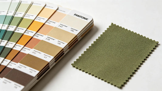
1. Embroidered & Woven Fabric Patches (Textile Pantone TPX Priority)
All thread color follows Pantone Textile TPX swatch standard specially formulated for fabric yarn; avoid using solid coated Pantone C code originally designed for printing ink. Coated C card has higher color saturation which cannot be fully replicated by polyester embroidery thread, main source of finished dark/bright color deviation.
Key: Confirm TPX code + physical thread sample double verification before bulk thread procurement.
2. PVC Rubber Patches (Coated Pantone C Standard Mainstream)
PVC liquid pigment mixing refers to Pantone Coated C color card; pigment formula is adjusted according to C value saturation, more suitable for rubber solid color performance than textile TPX. Transparent semi-transparent PVC needs separate customized pigment proportion as standard card cannot fully simulate translucent effect.

Three Main Causes Of Patch Color Deviation
- Screen color illusion: Phone/computer screen backlight improves color brightness; naked-eye finished product always slightly dimmer than digital draft without Pantone benchmark.
- Raw material limitation: Natural polyester thread has subtle color deviation among different production batches; PVC base rubber’s off-white base affects final bright tone presentation.
- Light source metamerism: Same patch shows different shade under indoor warm lamp, natural sunlight and cold LED light, easy to misjudge defective color.
Standard Pre-Production Color Lock Workflow To Avoid Bulk Error
- Submit exact Pantone code (distinguish TPX/C per craft) instead of vague color description like “light red” or “navy blue”.
- Require factory produce small color swatch sample matching designated Pantone and send physical sample for buyer signature confirmation.
- After sample approval, factory keeps confirmed physical swatch as bulk production inspection benchmark instead of digital picture only.
- First piece test run within first day of bulk production; spot check against confirmed swatch to adjust thread/pigment formula timely.

Practical Remedy For Minor & Severe Color Mismatch After Production
Minor acceptable shade gap within industry tolerance range
Color difference close to benchmark within naked-eye subtle range, no remake needed; adjust future next batch pigment/thread proportion according to feedback.
Large obvious color shift far away from Pantone standard
Negotiate free remake or partial order discount based on responsibility division: supplier bears cost for wrong factory formula; buyer takes charge if submitted wrong Pantone code initially.
Respective Color Matching Tips For Special Color Types
- Metallic Gold/Silver: No standard Pantone can fully replicate metal luster; refer factory existing metallic thread/PVC metallic pigment physical sample for confirmation.
- Fluorescent Neon Color: High-saturation neon shade needs customized special pigment, most standard Pantone swatches cannot cover full neon brightness range.
- Pastel Light Shade: Light pink, cream, baby blue easily affected by base fabric background; add base white underlayer on patch to stabilize final light color performance.

Common Color Matching Mistakes Buyers Frequently Make
- Use Pantone Coated C for embroidered patch thread selection leading over-saturated unreachable color requirement.
- Confirm color only by mobile screen photo without physical swatch approval resulting large-batch whole order off-color.
- Ignore light source difference and judge patch color only under indoor warm yellow lamp leading unnecessary remake dispute.
Final Summary Core Rule
Fabric embroidery/woven = Pantone TPX; PVC rubber = Pantone Coated C; accurate code + signed physical sample = core of zero large batch color error; never confirm color only via digital screen.
Distinguish Pantone code system by craft in advance to cut color deviation probability drastically.

Frequently Asked Questions
Q1: Which Pantone standard fits embroidered thread color matching?
A: Pantone TPX textile card is the exclusive standard for embroidery and woven yarn.
Q2: What Pantone code applies for custom solid color PVC patches?
A: Pantone Coated C coated card is mainstream reference for PVC pigment blending.
Q3: Why finished patch always darker than computer design picture?
A: Screen backlight enhances color brightness, physical raw material cannot reach screen saturation without Pantone benchmark.
Q4: How to fix obvious bulk patch off-color problem?
A: Confirm responsibility first; factory wrong formula supports free remake, wrong buyer code bears modification expense.
Tags:
Previous
Top 10 Most Popular Custom Patch Trends In Recent Years | Hot Design Themes & Craft Preferences
Next
Custom Patch Minimum Order Quantity (MOQ) Breakdown | Embroidery/Woven/PVC MOQ Rules & Low MOQ Order Tips