How to Design Custom Patches: Step-by-Step Beginner’s Design Guide
Designing your own custom patches is one of the most fun and creative parts of customization. Whether you want to make personalized patches, team emblems, brand logos or event souvenirs, a good design directly determines the final texture, recognition and collection value of the patch.
However, most beginners make the same mistakes: overly complicated details, unreadable tiny text, inappropriate color matching, mismatched craftsmanship and unreasonable proportions. Even high-end production technology cannot save an unprofessional design, resulting in blurry patterns, distorted details and unsatisfactory finished products.
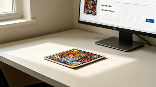
You do not need professional graphic design experience to create perfect patches. This complete beginner-friendly guide will walk you through the entire custom patch design process step by step. From determining core positioning, selecting sizes and shapes, to matching colors, fonts and craft adaptation rules, we cover every key detail to help you design production-ready, high-quality custom patches easily. Trusted custom 3D embroidered patches supports all custom design styles and perfectly restores your creative drafts.

Step 1: Confirm Patch Usage & Design Positioning First
Before drawing patterns, clarify the core purpose of the patch, which determines all subsequent design choices:
Daily Wearing Patches
Prioritize simplicity, compatibility and versatility. Avoid overly exaggerated and messy designs. Choose moderate colors and classic shapes to match most clothes, hats and bags.
Team & Uniform Patches
Focus on recognition, formality and unity. Highlight team logos, names and identity elements, with neat layout and standardized color matching consistent with brand or team VI.
Event & Souvenir Patches
Focus on thematic elements and collection value. Highlight event mascots, slogans and exclusive symbols, with rich details and strong commemorative attributes.
Personality & Collection Patches
Pursue uniqueness and creativity. Support irregular shapes, personalized slogans and niche design styles to stand out from ordinary patches.
Step 2: Choose the Right Size & Proportion
Size is the foundation of patch design. Many design failures are caused by mismatched size and details.
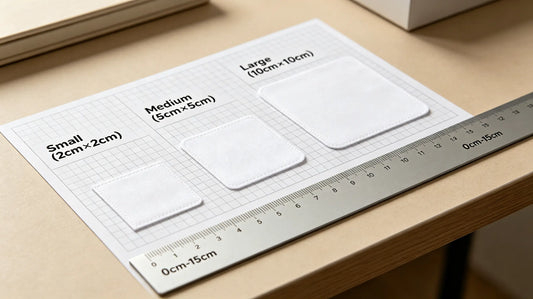
Universal Size Standards for All Scenarios
- 4cm–6cm (Mini & Hat Size): Suitable for hat decoration, collar marks and small accessory logos. Keep text and patterns simple.
- 6cm–8cm (Standard Golden Size): The most balanced size, suitable for chest, sleeve and backpack display, perfect for most pattern and text layouts.
- 8cm–11cm (Large Decorative Size): Used for jacket back and large-area display, can accommodate complex layered patterns.
Key Design Rule
The smaller the patch, the simpler the details. Never arrange dense text and complex patterns on patches smaller than 6cm, which will cause serious blurring after production.

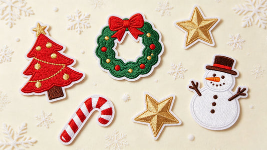
Step 3: Select Patch Shape to Match Your Style
Shape determines the overall temperament of the patch. Choose according to design positioning:
Classic Regular Shapes (Safe & Formal)
- Round/Oval: Gentle, inclusive, suitable for holiday, casual and brand emblems.
- Square/Rectangle: Neat, rigorous, ideal for text labels, name tags and corporate logos.
- Shield: Tough, ceremonial, perfect for team, school and security uniform patches.
Custom Irregular Shapes (Creative & Personalized)
Cut according to the outline of patterns, animals, mascots, icons and slogans. Irregular patches have high recognition and are not easy to duplicate, very suitable for event souvenirs, morale patches and trendy personalized designs.
Design tip: Irregular shapes need smooth outlines; avoid sharp slender protrusions that are easy to break.
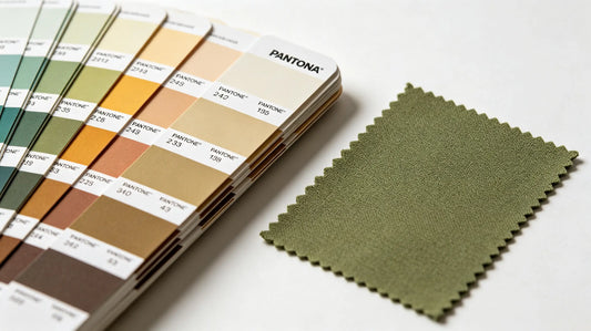
Step 4: Professional Color Matching Rules
Color directly affects the visual grade and recognition of patches. Follow these rules to avoid tacky and messy color schemes:
1. Control the Number of Colors
For embroidered patches, control colors within 3–5 types. Too many colors will make the layout messy and increase production cost. PVC patches can support more colors, but excessive color stacking is still not recommended.
2. Follow High Contrast Principle
Use dark background with bright text or light background with dark patterns to ensure clear recognition from a distance. Low contrast colors such as light yellow on white and gray on silver will cause blurred vision.
3. Unify Color Tone
Match warm colors with warm tones and cool colors with cool tones. Avoid random mixing of high-saturation contrasting colors, which reduces texture.
4. Reference Brand & Scene Colors
Team and corporate patches follow official brand colors; holiday and event patches match scene-themed tones to enhance immersion.

Step 5: Font Design & Text Layout Standards
Text is the core information carrier, and improper font selection is the most common beginner mistake.
Best Font Choices
- Prioritize bold, thick sans-serif fonts: clear strokes, not easy to blur, highest restoration rate.
- Avoid thin line fonts, cursive fonts and overly artistic twisted fonts: tiny strokes will merge during embroidery or molding.
Text Size Rules
- Embroidered patches: minimum readable text height 4mm
- Woven patches: minimum readable text height 2mm
- PVC patches: minimum readable text height 3mm
Layout Tips
- Centralize core slogans and key information
- Do not arrange text too close to the edge, reserve 0.3cm margin
- Avoid dense paragraph text; split into short and powerful single lines
Step 6: Pattern & Detail Optimization (Most Critical Step)
Excellent patches are simple but not monotonous. Optimize details according to craft characteristics:
For Embroidered Patches
- Avoid large-area solid color filling, easy to appear flat and hollow
- Appropriately add outline lines to layer the pattern
- Simplify scattered tiny decorative points that cannot be displayed clearly
For PVC Rubber Patches
- Distinguish primary and secondary layers for 3D raised designs
- Set different thicknesses for core patterns and auxiliary patterns
- Support complex full-color gradients, but avoid overly messy overlapping elements
For Woven Patches
- Give up 3D stereo effects, focus on flat delicate details
- Give priority to thin lines and tiny text display advantages

Step 7: Match Craft & Border According to Design Style
Active matching of craftsmanship after design can maximize the display effect:
- Simple logos + text → Flat embroidery / Woven patches (cost-effective & clear)
- Stereo texture + high-grade appearance → 3D puff embroidery
- Full-color complex patterns + outdoor use → PVC rubber patches
- Retro minimalist brand style → Leather patches
Border Selection
- Merrow border: formal, three-dimensional, suitable for team, uniform and collection patches
- Heat cut border: simple, cost-effective, suitable for daily and event giveaway patches
Step 8: Select Suitable Backing for Usage Scenarios
Complete the final design configuration with backing selection:
- Daily replacement & frequent disassembly → Velcro backing
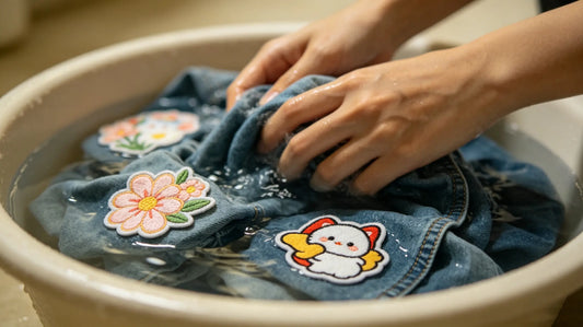
- Long-term wearing & repeated washing → Sew-on backing
- Quick installation & casual use → Iron-on backing
- Static display & decoration → Self-adhesive backing
Common Beginner Design Mistakes to Avoid
- Too many details and dense text on small-sized patches, resulting in blurred finished products.
- Low-contrast color matching, making patterns unrecognizable.
- Using ultra-thin fonts and lines that cannot be restored by craftsmanship.
- Blindly adding 3D effects and complex layers for simple designs, resulting in redundant and bloated vision.
- No edge margin reserved, causing pattern cutting loss.
- Inconsistent style elements, mixing too many unrelated patterns.
Pro Design Tips for Higher-Grade Patches
- Simplify, don’t complicate: The best patch designs are clean, recognizable and memorable.
- Unified style elements: Keep lines, tones and decorative styles consistent throughout the patch.
- Highlight core focus: Let the logo or slogan be the main body, and auxiliary patterns serve as decoration only.
- Reserve appropriate blank space: Avoid full layout, properly empty edges to improve grade.
- Test remote recognition: Step back 2–3 meters to check if the pattern and text are still clear.

Final Custom Patch Design Summary
Professional patch design does not rely on complex skills, but on standardized size matching, reasonable detail control, scientific color matching and craft adaptation.
The core logic of patch design: suitable size + clear details + high contrast color + matching craft. Beginners only need to follow step-by-step specifications to create professional-level custom patches.
Whether it is personalized creativity, team identification or event commemoration, standardized design rules can avoid production failure and make every custom patch present the best visual effect and practical value.
Frequently Asked Questions
Q1: Do I need design experience to make custom patches?
A: No, follow this step-by-step guide to create professional designs without experience.
Q2: What font is best for patch text?
A: Bold sans-serif fonts are the clearest and most production-friendly.
Q3: How many colors are best for custom patches?
A: 3–5 colors are the most balanced for beauty and cost control.
Q4: Can complex gradient designs be made on patches?
A: PVC patches support perfect gradients; embroidery is not suitable for complex gradients.
Tags:
Previous
Cheap Custom Patches: How to Get High-Quality Patches on a Budget
Next
Patches vs Stickers: Which Is Better for Branding & Promotion