Custom Patch Color Guide: Color Matching Rules & Popular Combinations
Color is the most intuitive visual element of custom patches. Good color matching can enhance recognition, highlight design themes and perfectly fit the usage scenario and brand style. Unreasonable color collocation will make patches look messy, dull or unrecognizable, even if the pattern and shape are well designed.
Many beginners blindly use multiple bright colors or similar tones, resulting in poor presentation. This guide combines color theory, industry practical experience and scene characteristics, sorting out basic color rules, classic combinations, brand color application, style matching and common pitfalls. Whether for team uniforms, fashion decorations, tactical patches or souvenir gifts, you can find suitable color solutions here. Custom 3D embroidered patches supports full-color customization to realize all your color design ideas.

Basic Color Principles for Patch Design
1. Control the Total Number of Colors
For most conventional patches, limit the total colors within 3–5 kinds. Too many colors will make the layout cluttered, increase production difficulty and cost, and weaken the main pattern. Simple logos and text patches are recommended to use 2–3 colors for a concise effect.
2. Distinguish Main Color, Auxiliary Color & Border Color
- Main color: Accounts for the largest area, determines the overall tone and style.
- Auxiliary color: Decorates details, enriches layers, cannot overwhelm the main color.
- Border color: Separates the patch from the background, enhances the outline, generally uses contrasting or matching tones.
3. Two Core Matching Modes
- High contrast: Strong color difference, eye-catching and highly recognizable, suitable for sports, tactical, outdoor and activity patches.
- Low contrast: Similar hue, soft transition, elegant and low-key, suitable for business uniforms, high-end brands and retro styles.
4. Adapt to Background Fabric Color
When matching with dark clothes, choose light or bright main colors; when matching with light clothes, use dark or saturated colors. Avoid patches and fabrics with too close tones, which will lead to invisible patterns.
Classic Universal Color Combinations
1. Black & White / Black & Gray
Timeless minimalist combination, strong sense of hierarchy. Applicable to all styles, from formal business to street fashion. Works perfectly with embroidered, PVC and leather patches.
2. Navy & White / Navy & Yellow
Classic team color scheme, stable and energetic. Widely used for sports teams, school uniforms, security and public service teams.
3. Red & White / Red & Black
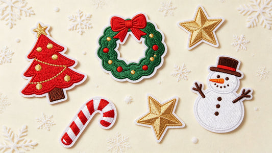
Passionate and striking, high visual impact. Ideal for sports clubs, event souvenirs, team honor patches and festive themed designs.
4. Khaki, Brown & Beige
Classic retro earth tone group. Matches leather patches, denim outfits and vintage style products, creating a warm old-school vibe.
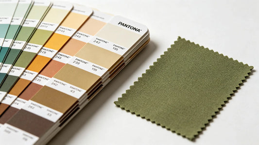
5. Army Green, Olive & Black
Exclusive tactical and outdoor color system. Low saturation, practical and resistant to dirt, the mainstream choice for morale patches and outdoor gear.
6. Blue Series Matching
Light blue + white, dark blue + gray. Fresh and calm, suitable for medical, aviation, catering and office service industries.

Color Matching by Patch Style
1. Formal & Business Style (Uniforms, Corporate Logos)
Prioritize low saturation, steady tones: navy, dark gray, dark blue, burgundy, black. Use low-contrast collocation, avoid overly bright neon colors. Ensure neat and professional visual effect.
2. Sports & Dynamic Style (Team Jerseys, Competition Emblems)
Choose high-saturation, high-contrast colors: red, royal blue, bright yellow, orange. Bold color blocks enhance vitality and on-field recognition.
3. Retro & Vintage Style (Hats, Denim, Leather Patches)
Select earth tones, faded colors and matte tones: khaki, coffee, mustard yellow, dark green, vintage red. Reduce color brightness to restore classic texture.
4. Tactical & Outdoor Style (Morale Patches, Gear Accessories)
Mainly use military color palette: army green, olive drab, sand color, black, dark gray. A small amount of orange or red can be added as warning or decorative details.
5. Cute & Cartoon Style (Children’s Wear, Fashion Gifts)
Adopt bright, soft high-brightness colors: pink, sky blue, light yellow, mint green. Match lively multi-color combinations, keep the tone soft and not dazzling.
6. Minimalist High-End Style (Brand Labels, Premium Merchandise)
Single color or two-color matching, low saturation and low contrast. Black, white, gray, camel and dark blue are preferred, highlighting texture and grade.
Brand Color Application Rules
Many corporate and brand patches need to strictly follow official VI color standards.
- Use the exact color number provided by the brand to avoid color deviation during production.
- If the brand main color is light, use dark color for text and lines to ensure readability.
- When the brand has multiple standard colors, take the core color as the main tone, and use auxiliary colors for details only.
- For multi-scene application, keep the main color unchanged, and slightly adjust the border color according to different fabrics.

Color Selection by Patch Craft
Embroidered Patches
Rich color adaptability. Both high-contrast bold colors and soft low-saturation colors work well. Thick threads present full color saturation; avoid using too many tiny color segments which are easy to mix.
Woven Patches
Excellent for restoring delicate gradient and fine color transitions. Suitable for brand standard colors and complex multi-line patterns with high color requirements.
PVC Rubber Patches
Bright and full color performance, can present translucent, luminous and reflective special color effects. Ideal for bold color blocks and creative color designs.
Leather Patches
Mainly use natural matte tones: coffee, khaki, black, dark brown. Bright colorful matching is rarely used, focusing on the original texture of leather.
Color Matching for Different Application Carriers
Hats
Curved surface with strong visibility requirements. Choose high-contrast combinations for front main patches; soft colors are acceptable for small side decorative patches. Dark hats match light-colored patches, and light hats match dark-colored patches.
Work & Sports Uniforms
Unified color scheme for the whole team. Follow industry fixed color habits, ensure consistent color of all staff patches, and prioritize recognition and formality.
Backpacks & Bags
Loose color restrictions. Large main patches can use bold color combinations; small auxiliary patches adopt unified tone to keep overall coordination.
Event Souvenir Patches
Combine event theme and activity atmosphere. Festive activities use warm bright colors; outdoor challenges use earth and military tones; art activities use personalized creative color schemes.

Common Color Mistakes to Avoid
- Overusing more than 6 colors on a single patch, leading to messy vision and increased cost.
- Using similar foreground and background colors, making patterns and text hard to distinguish.
- Matching overly bright neon colors for formal uniforms, destroying professional style.
- Applying high-saturation fancy colors on leather patches, covering the original retro texture.
- Ignoring color deviation of different crafts: the same color number may have slight difference on embroidery and PVC.
- Randomly changing brand standard colors, resulting in inconsistent brand image.
Final Summary
Patch color matching takes scenario adaptation, style unification and clear recognition as the core.
Control the number of colors reasonably, distinguish main and auxiliary tones, and select high or low contrast schemes according to positioning. Steady tones for formal occasions, high-contrast bright colors for sports and outdoor scenes, earth matte tones for retro styles.
Combining color rules with patch craft, carrier and brand requirements can make the color design both beautiful and practical, greatly improving the overall quality of custom patches.

Frequently Asked Questions
Q1: How many colors are suitable for a regular custom patch?
A: It is best to control within 3 to 5 colors for a neat and clear effect.
Q2: What color combination is the most versatile for patches?
A: Black and white, black and gray are timeless and fit all styles.
Q3: What colors are recommended for tactical outdoor patches?
A: Army green, olive, sand color and black are the mainstream choices.
Q4: How to ensure brand colors are accurately restored on patches?
A: Provide official color codes and confirm color samples before mass production.
Tags:
Previous
Patch Border Guide: Merrow Edge, Heat Cut & No Border Comparison
Next
Custom Patch Size Guide: Standard Dimensions for All Uses