Custom Patch Color Matching Guide | Pantone Standard, Color Deviation Causes & Fix Tips
A large number of custom order disputes root in unexpected color difference between customer’s electronic design and delivered finished patches. Mobile/monitor display uses RGB luminous color mode while real patch thread and PVC pigment adopt physical CMYK/Pantone solid color system, fundamental color principle gap inevitably brings minor natural chromatic aberration. Understanding industry color matching specification helps buyers set reasonable expectation and cut color-related remake cost.
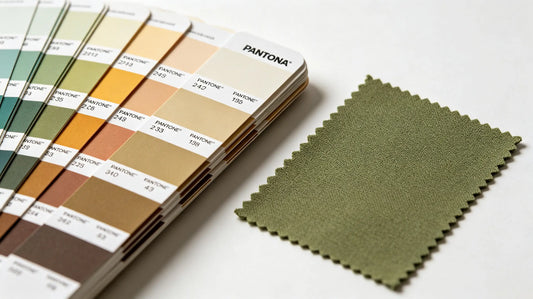
Custom 3D embroidered patches adopts global standard Pantone solid color system for all patch production to control color deviation within acceptable industry tolerance.

Part 1: Core Color Standard Definition & Usage Rule
- Pantone Solid Coated (PMS): Global universal standard for patch customization; factory matches embroidery thread and PVC pigment strictly against physical Pantone paper swatch, highest color accuracy option for formal bulk orders.
- Digital RGB screen color: Only used for preliminary layout preview, cannot serve as final production color reference due to backlit screen color enhancement.
- Printed CMYK artwork: Suitable for design layout confirmation; printed paper also has slight color drift vs actual textile/rubber raw material.
Key Rule: Confirm final color via physical Pantone number or real color swatch instead of phone/laptop screen preview.
 Part 2: Three Main Root Causes Of Patch Color Deviation
1. Display hardware difference
Different brand monitor, mobile screen, brightness setting change original RGB tone; same artwork displays distinct shade on Apple screen and Windows monitor.
2. Raw material inherent property gap
- Embroidery/Woven: Polyester thread absorbs light differently from flat printed paper, bright digital yellow may turn muted mustard yellow after thread weaving.
- PVC Rubber: Liquid pigment solidifies after high-temperature molding leading subtle darkening of final rubber tone.
3. Ambient light inspection difference
Art check under warm indoor incandescent lamp vs cool natural outdoor daylight creates obvious visual color shift; daylight is industry standard inspection environment.

Part 3: Craft Specific Color Tolerance Industry Standard
- Embroidered Patches: Allow minor reasonable shade deviation within 5% range due to overlapping thread stacking effect; dense stitch area appears darker visually.
- Woven Patches: Superior color uniformity with tighter tolerance around 3%, thin flat yarn presents color closer to original Pantone reference.
- PVC Rubber Patches: Pigment solidification brings slight darkening, pre-production pigment swatch confirmation greatly reduces finished color error.
Part 4: Practical Ways To Minimize Color Mismatch Risk
- Provide exact Pantone PMS number for each design color as primary production reference instead of screen picture.
- Request factory pre-make small color swatch sample and sign off confirmation before full bulk manufacturing.
- Avoid ultra-bright neon color for embroidery; limited thread stock leads higher possibility of approximate alternative color replacement.
- Check approved sample under natural daylight before bulk approval, reject under indoor warm lamp only inspection.

Part 5: Common Color Related Custom Mistakes To Avoid
- Confirm bulk production purely based on phone screen color without Pantone code or physical color sample → large-scale color mismatch and full batch remake.
- Ignore thread stacking darkening feature and design large solid bright color block on embroidery → finished area visibly darker than expected.
- Select neon special pigment for PVC without pre-test sample → pigment batch fluctuation triggers inconsistent color across bulk goods.
Final Summary Core Rule
Pantone number + physical color swatch = most reliable color reference; screen RGB only for layout viewing; check sample under natural daylight; embroidery allows tiny thread stacking dark shift, PVC note pigment curing darkening.
Standardize color confirmation process to eliminate most color dispute risks effectively.

Frequently Asked Questions
Q1: Which color reference is most accurate for custom patch mass production?
A: Official Pantone PMS solid coated number is industry standard highest precision color reference.
Q2: Why same design looks different on screen and finished physical patch?
A: Screen uses luminous RGB while patches use physical solid pigment/thread, inherent color system difference causes natural deviation.
Q3: Which patch craft owns the tightest color matching tolerance?
A: Woven patches have minimum color variation thanks to thin uniform interlaced yarn structure.
Q4: How to avoid large-batch wrong color remake loss?
A: Confirm pre-production physical color swatch sample before launching full bulk production.
Tags:
Previous
Self Adhesive Stick On Custom Patches Guide | Suitable Surfaces, Installation Steps & Limitation Tips
Next
Custom Patch Care & Washing Maintenance Guide | Extend Service Life & Prevent Fading, Peeling