Pantone Color Matching for Custom Patches | Color Guide for Embroidery & 3D Puff Patches
Color is the most intuitive element that shapes the style of custom 3D puff embroidered patches. A well-matched color scheme can instantly enhance the texture and appeal of the design, while slight color deviation will make the whole product look unprofessional. For commercial orders, team uniforms and brand merchandise, consistent color presentation across the entire batch is even more crucial to maintain a unified image.
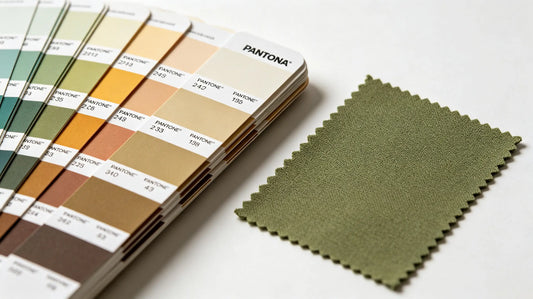
In the custom patch industry, Pantone color system has become the universal standard for accurate color matching. It unifies color standards between designers, buyers and manufacturers, effectively solving the problem of color difference caused by different display screens and material differences. Many customers encounter color mismatch after receiving goods, mostly because they do not use standard color cards or lack correct color selection and proofing methods.
This guide focuses on Pantone color application in patch customization, including basic color classification, classic color combination schemes, color matching rules for different styles, and practical methods to avoid color deviation. Whether you design simple solid-color patches or complex multi-color 3D puff patches, you can get reliable color solutions here. Reliable custom 3D embroidered patches strictly follows Pantone standards for color mixing to ensure every patch restores the designed hue accurately.

Why Pantone Color Matching Is Necessary for Patches
Digital pictures on mobile phones and computers will have color distortion due to screen parameters, brightness and resolution. The same design may show different tones on different devices, which leads to inconsistent understanding between buyers and manufacturers. Relying solely on image colors for production is the main cause of finished product color deviation.
Pantone color card is a physical color standard with fixed hue, saturation and brightness. Each color has an exclusive number. Manufacturers can select the corresponding embroidery thread according to the physical color card, realizing one-to-one color restoration. This standard is widely used in embroidery, clothing, printing and other industries, and is especially suitable for bulk orders that require high color consistency.
In addition, different materials will affect color presentation. Polyester thread, metallic thread and luminous thread have different gloss and color rendering effects. Using Pantone as the unified standard can also guide thread selection and reduce the difference between design draft and finished patch. For 3D puff patches, the raised structure changes light reflection, and standard color matching can also control the visual tone under different light angles.
Basic Color Classification & Application Scenarios
We can divide common patch colors into four major categories according to style and usage, making color selection more targeted.
Basic neutral colors include black, white, gray and navy blue. These tones are versatile and never go out of style. Black and dark gray are low-key and tough, widely used in tactical patches, streetwear and daily casual decorations. White and light gray are clean and concise, suitable for matching with dark clothing and simple logo designs. Navy blue is steady and formal, the preferred color for corporate uniforms, school badges and business style patches. Neutral colors are easy to match with other hues and have extremely high color fastness after embroidery.
Earth and military tones cover army green, coyote brown, khaki, olive and tan. This series has strong field attributes and is the mainstream color palette for tactical morale patches, outdoor gear and military style designs. The overall tone is low saturation, not easy to be dazzling, and has strong adaptability in outdoor environments. Such colors are mostly used in single or two-color matching, highlighting a rough and practical style.
Bright saturated colors include red, yellow, orange, royal blue and vivid green. These high-brightness colors are eye-catching and full of vitality. They are commonly used for sports team patches, event commemorative patches, children's clothing decorations and brand promotional merchandise. Bright colors can quickly attract attention, but need to control the collocation quantity. Too many saturated colors will make the design messy.
Soft pastel colors contain light pink, mint green, lavender, light blue and beige. With low saturation and soft tone, they are popular in fashion apparel, accessories, gift patches and female style designs. Pastel colors present an elegant and gentle temperament, mostly applied to small decorative patches and high-end customized products.

Classic Color Combination Schemes for Patches
Two-color matching is the most common form for patches, with simple structure and clear hierarchy. The combination of neutral color plus bright color is the safest choice. Using black, navy or gray as the main body, and adding red, yellow or blue as embellishment can create distinct layers while avoiding visual clutter. This scheme is suitable for team logos, slogan patches and daily 3D puff patches.
Similar color matching uses colors close in hue, such as different shades of green, blue or brown. The overall tone is unified and harmonious, presenting a high-end and coordinated feeling. It is often used for retro style, high-end brand patches and commemorative badges. This matching requires strict control of light and shade difference to prevent adjacent colors from blending together and blurring the pattern outline.
Contrast color matching adopts colors with large hue difference, such as red and black, blue and yellow, green and white. Strong color contrast makes the pattern more recognizable, ideal for sports teams, activity signs and patches that need long-distance recognition. When using contrast colors, keep the color dividing line neat to avoid thread color bleeding.
For multi-color complex designs, follow the principle of one main color plus two to three auxiliary colors. Do not use more than five colors on a single patch. Excessive colors will increase production difficulty, raise the risk of color deviation, and also damage the overall aesthetic sense. For 3D puff patches, reduce the color quantity appropriately, so that the three-dimensional effect and color performance can complement each other.
Color Matching Tips for Different Patch Styles
For formal uniforms, work clothes and school patches, prioritize neutral colors and low-saturation earth tones. The color scheme should be simple, generally controlled within two to three colors, to maintain a rigorous and standardized team image. Avoid overly bright and fancy colors. The color of the patch should also echo the main tone of the clothing to ensure overall coordination.
Tactical and outdoor patches mainly use military color series. Take army green, coyote brown and black as the main colors, and use a small amount of red or orange as warning embellishment. The overall tone is low-key and unified, matching the style of tactical gear. Do not use a large area of bright colors, so as not to destroy the practical positioning.
Fashion and streetwear patches can adopt more bold collocations. You can try contrast colors, gradient colors and multi-color combinations according to the design style. Retro styles choose matte earth tones and faded colors; trendy street styles can use high-saturation colors and metallic gold and silver for decoration.
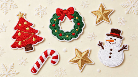
Children's patches and activity souvenir patches are suitable for bright and lively colors. Rich color matching can cater to youthful and active atmosphere, but still keep the layout orderly to prevent too messy visual effect.

Color Matching for 3D Puff Patches
The raised structure of 3D puff patches will change light reflection, so color design needs minor adjustments compared with flat patches. The raised surface receives more light and the color will look slightly lighter, while the concave edge parts appear darker. When selecting colors, appropriately improve the saturation of the main color to ensure the tone is uniform when viewed from all angles.
For large-area 3D raised patterns, reduce the color types as much as possible. Too many color boundaries on the curved surface will look scattered. Use one main color for the whole raised area, and set decorative colors on the flat edge part. Metallic thread matched with 3D puff effect can enhance the sense of hierarchy, and the reflective luster is more prominent on the three-dimensional surface.
Do not use colors with too small light and shade difference on adjacent 3D areas. Due to light and shadow effect, similar colors will be difficult to distinguish, resulting in blurred patterns.
Practical Ways to Avoid Color Deviation
First, provide physical Pantone color number or color card as the standard, instead of only sending picture files. Physical color is the most reliable reference to eliminate screen color difference. Second, require a pre-production sample before bulk production. Check the color effect under natural light, indoor light and shadow environment respectively, and confirm no deviation before mass production.
Third, unify the thread material. Different threads such as polyester, cotton and metallic have different color rendering effects. Determine the thread type at the beginning of design to avoid tone change caused by material replacement. Fourth, for large orders, select multiple samples from different positions of the finished goods for color comparison to ensure batch consistency.
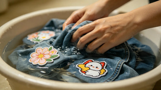
Fifth, understand the characteristics of thread color fastness. Some bright colors will have slight fading after the first few times of washing. Choose high color fastness threads for products that need frequent cleaning.

Common Color Mistakes to Avoid
Using too many colors on a single patch is the most frequent mistake, which increases production difficulty and makes the design complicated and unrefined. Second, relying entirely on computer pictures to confirm colors, resulting in obvious color difference between finished products and drafts.
Third, matching similar colors on adjacent patterns without obvious light and shade distinction, leading to blurred pattern outlines. Fourth, using a large area of high-saturation contrast colors on formal uniform patches, destroying the solemn style.
Fifth, ignoring the light and shadow influence of 3D structure, resulting in uneven color vision on raised patches. Following the above color rules can effectively avoid these problems.
Final Color Matching Summary
Color is the soul of custom patch design. Using the standard Pantone color system is the fundamental way to realize accurate color restoration. Different color series correspond to different styles and usage scenarios. Reasonable two-color, similar color and contrast color collocation can make the patch design more layered and attractive.
Combined with the structural characteristics of 3D puff patches, targeted color adjustment can optimize the visual effect under light and shadow. Meanwhile, completing color confirmation through physical color cards and pre-production samples can greatly reduce the risk of batch color deviation.
Mastering professional color matching skills will not only improve the appearance quality of 3D puff embroidered patches, but also make the whole customization process smoother and more efficient.

Frequently Asked Questions
Q1: What is the standard for patch color matching?
A: Pantone color card and corresponding color number are the universal industry standard.
Q2: How many colors are suitable for a single ordinary patch?
A: It is recommended to control within 3 to 4 colors for neat and clear effect.
Q3: What colors are mostly used for tactical patches?
A: Army green, coyote brown, khaki and black are the classic tactical color series.
Q4: Why do 3D puff patches look different in color from different angles?
A: The raised structure causes light and shadow changes. Appropriately increase color saturation during design to improve uniformity.
Tags:
Previous
Embroidery Thread Types for Custom Patches: Material, Color & Performance Guide
Next
Custom Patch Design Tips for Beginners | Step-by-Step Guide to Great Patch Art