Custom Patch Design Tips for Beginners | Step-by-Step Guide to Great Patch Art
Creating a perfect custom 3D puff embroidered patch is more than just drawing a nice picture. Many beginners make beautiful digital designs, yet end up with unsatisfactory finished patches after production. Tiny blurred details, distorted lines, crowded layouts and damaged 3D effects are common problems caused by ignoring embroidery production rules.
Patch design needs to balance artistic creativity and production feasibility. A design that looks great on screen may not adapt to embroidery stitching and 3D foam structure. Understanding basic layout rules, detail limits, font selection and craftsmanship matching will help you turn creative ideas into qualified physical patches smoothly.
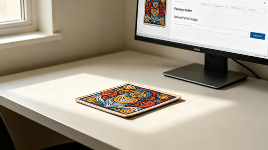
This guide gathers practical design tips specially for beginners. From initial draft planning, graphic layout, text setting to exclusive rules for 3D puff patches, every key step is explained clearly. Whether you design patches for personal use, team activities or commercial sales, these suggestions will greatly improve your design success rate. Reliable custom 3D embroidered patches also provides professional design review to optimize your artwork before formal production.

Start with Clear Design Goals & Basic Planning
Before putting pen to paper, confirm your core demands first. Clarify the usage scenario, target style, patch size and shape in advance. Different uses require totally different design directions. Formal uniforms and badges need neat, concise and solemn styles, while fashion and streetwear patches can adopt bold, personalized and complex creative elements.
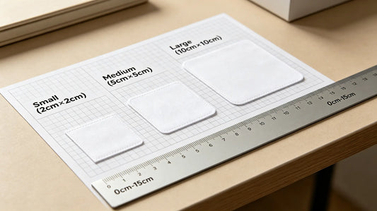
Determine the exact patch size at the early design stage. The maximum detail density and line thickness are restricted by physical dimensions. If you plan a 3cm mini patch, do not add too many tiny patterns and words. For large patches over 12cm, you can enrich layers and decorative elements properly. Meanwhile, select the patch shape first, and arrange all content within the outline range to avoid layout overflow.
Also decide whether to make flat embroidery or 3D puff patches. The two crafts have different design limitations. Confirming the craft at the beginning can avoid repeated modification of the draft in the later stage. Good pre-planning can save lots of time and reduce revision times.
Master Basic Layout & Composition Rules
Balanced composition is the foundation of good-looking patches. Most standard patches adopt centered layout, which is stable, neat and suitable for logos, emblems and badge-style designs. Place the core pattern or main text in the middle, and arrange auxiliary patterns and decorative elements evenly around it. Keep the overall visual weight symmetrical on the left and right, top and bottom.
Asymmetrical layout is often used for creative irregular patches and streetwear styles. This layout is more flexible and dynamic, but beginners should control the overall density. Do not pile all elements on one side, which will make the patch look uncoordinated and messy. Leave proper blank space around key elements. Too full layout will cause crowded vision and affect the display of details.
For patches combining graphics and text, follow the rule of prominent focus. Set one main visual element, either the graphic pattern or the main slogan, and take the other as auxiliary decoration. Do not let graphics and text compete for visual focus at the same time. Reasonable hierarchy makes the design clear at a glance.

Control Pattern Details & Line Thickness
Embroidery is made of dense threads, so ultra-fine lines and tiny details cannot be restored perfectly. This is the most common pitfall for new designers. As a general rule, the minimum line thickness for embroidered patches should not be less than 1.5mm. Lines thinner than this standard will stick together or break during stitching, turning into blurred blocks.
Avoid designing a large number of scattered tiny patterns, dots and complex textures. These subtle elements will lose definition after embroidery. If you need to express texture, use thick lines and large color blocks instead of dense fine lines. For small decorative patterns, simplify the outline properly and retain the most recognizable features.
When designing connected patterns, keep the lines continuous. Frequent broken lines will increase production difficulty and affect the firmness of stitching. For hollow and cutout designs, ensure the hollow area is large enough. Too small hollow parts are easy to be filled by threads and lose the original effect.
Font & Text Design Guidelines for Patches
Text is widely used on name patches, slogan patches, team numbers and commemorative patches. Choosing the right font and size directly affects readability. First of all, stay away from overly fancy cursive fonts and ultra-thin artistic fonts. Such fonts have complex strokes and thin lines, which will become indistinct after embroidery.
Bold, thick and standard sans-serif fonts are the most reliable choice for patches. The strokes are full and neat, easy to restore and clearly recognizable. If you prefer stylized fonts, select styles with thick strokes and simple structures, and appropriately enlarge the font size.
The minimum text height should not be lower than 4mm. Smaller letters will stick together and cannot be distinguished. Keep proper spacing between letters and lines. Crowded typesetting will also reduce readability. For long sentences and multi-line text, arrange the layout vertically or horizontally according to the patch shape, and do not twist the text at will.
When matching text and patterns, do not let complex patterns cover key words. Ensure the main information can be seen clearly at first sight.

Exclusive Design Rules for 3D Puff Patches
3D puff patches have foam inside to create raised effects, so there are extra limitations compared with flat embroidery. First, plan the raised areas reasonably. Do not split the 3D part into too many small scattered areas. Large and integrated raised surfaces can keep the foam uniform and not easy to collapse. Separated tiny raised blocks are prone to deformation and thread shedding.
Control the transition between raised areas and flat areas. The boundary should be smooth and natural, avoiding sharp right-angle turns. Sharp corners on 3D parts will bear excessive friction and wear quickly. Do not set too many color boundaries on the large raised surface. Too many color changes will make the three-dimensional layer messy.
The line thickness and detail standards of 3D puff patches are stricter. The raised surface bears extrusion and friction all the time, so overly thin lines and delicate details are more likely to be damaged. Simplify the details on the 3D area appropriately, and put complex patterns on the flat edge part.
In addition, do not design the whole patch as ultra-thick 3D puff. Moderate thickness presents the best stereo effect and durability.
Color Matching Tips for Beginner Designers
Beginners are recommended to start with simple color schemes. A single color or two-color matching is the easiest to control, with low production difficulty and stable finished effect. Gradually try three to four colors after getting familiar with the rules. Try your best to keep the total color quantity of a single patch within five. Too many colors will increase the risk of color deviation and messy vision.
Keep a clear boundary between different color blocks. Avoid overlapping and blending of similar colors. On the premise of conforming to the style, choose color combinations with moderate contrast to make the pattern outline clearer. Refer to classic color schemes of similar patches for inspiration, which can effectively avoid awkward color collocation.
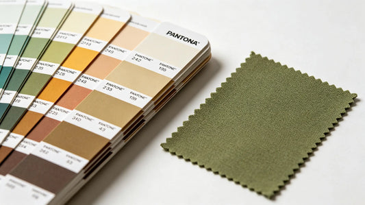
If you need high color accuracy, mark the corresponding Pantone color numbers on the design draft. It helps manufacturers restore the hue accurately and reduce color difference.

Check List Before Submitting Final Design
Before sending the artwork for production, complete a self-check according to the list. Confirm the patch size and shape are consistent with the plan, and all elements are within the outline. Check all lines and strokes, ensure no ultra-thin lines and over-tiny details. Verify text content, spelling and font size to prevent wrong words and unreadable letters.
Check the color partition, confirm the color quantity and mark Pantone numbers if needed. For 3D puff patches, reconfirm the range and rationality of raised areas. Finally, export the design file according to the manufacturer’s requirements. High-definition vector files are the best choice to ensure no blurring after amplification.
Completing these checks can eliminate most design defects in advance.
Common Beginner Design Mistakes to Avoid
The top mistake is adding excessive tiny details and ultra-thin lines, leading to blurred patterns after embroidery. Second, using complicated cursive fonts with small size, making the text unrecognizable. Third, designing scattered small raised areas on 3D puff patches, which are easy to deform and damage.
Fourth, using too many colors on one patch, causing chaotic vision and high color deviation risk. Fifth, ignoring the actual patch size and designing dense content for mini patches. Sixth, random layout without blank space, making the whole patch crowded and unrefined.
Learn from these common errors, and your design level will improve rapidly.

Final Beginner Design Summary
Custom patch design is a combination of creativity and craftsmanship. Excellent artwork must not only look artistic, but also adapt to embroidery production rules. For beginners, start with clear planning, reasonable layout, simplified details and practical fonts. Follow the line thickness, text size and color quantity standards, and make targeted optimization for 3D puff structure.
Do not blindly pursue complex effects at the beginning. Master the basic rules first, then try diversified styles and creative elements step by step. Every qualified physical patch is the result of careful design and repeated checking.
With these practical tips, you can effectively avoid common design problems and create professional, beautiful and durable 3D puff embroidered patches smoothly.
Frequently Asked Questions
Q1: What is the minimum line thickness for embroidered patches?
A: It is recommended to keep lines above 1.5mm to prevent sticking and breaking.
Q2: What font is most suitable for text on patches?
A: Bold sans-serif fonts are the best choice for clear display and easy embroidery.
Q3: How small can letters be on a patch?
A: The minimum height of letters should not be less than 4mm for normal recognition.
Q4: What should I pay most attention to when designing 3D puff patches?
A: Plan integrated raised areas, avoid scattered small blocks and overly sharp corners.
Tags:
Previous
Pantone Color Matching for Custom Patches | Color Guide for Embroidery & 3D Puff Patches
Next
Custom Patch Border Guide: Merrow Border vs Heat Cut Border Differences