Custom Patch Color Matching Guide 2026 | PMS Colors, Psychology & Best Palettes
Color is the most powerful visual element of any custom patch design. Even with perfect artwork, clean shapes, and premium materials, poor color matching can make your patches look blurry, unprofessional, washed out, or inconsistent across bulk orders.
Custom patch color matching is not just about picking pretty shades — it follows strict industry production standards, material limitations, contrast rules, and brand color accuracy protocols. Whether you are ordering embroidered, woven, PVC, leather, or printed patches, this guide will help you achieve factory‑accurate, eye‑catching, and brand‑consistent colors every time you order custom embroidered patches.

1. Industry Standard: Pantone PMS Color Matching
The custom patch industry relies exclusively on Pantone Solid Coated (PMS) color codes for precise color replication. This is the only reliable standard for bulk consistency.
Why RGB / CMYK / Screen Colors Are Invalid
- Phone screenshots, website previews, and digital RGB files shift brightness based on screen settings
- CMYK print colors do not translate accurately to thread, rubber, or leather materials
- Lighting differences cause huge visual gaps between digital mockups and physical patches
Official Matching Rule
Every distinct color in your patch design must be assigned a unique PMS color number. This ensures every batch, every thread, and every patch material matches perfectly with zero random color drift.
2. Material‑Specific Color Limitations
Different patch materials render colors differently. Understanding these limits prevents impossible color requests and disappointed results.
Embroidered Patches
- Limited to solid thread colors
- No true gradients, blends, or ultra‑subtle tone shifts
- Best with 3–6 bold, separated colors for clarity
- High saturation colors reproduce best; pastels are limited
Woven Patches
- Finest color accuracy among fabric patches
- Smooth tone transitions and sharp tiny color details
- Ideal for multi‑color logos and fine text
PVC Rubber Patches
- Deep, solid, opaque color reproduction
- Color saturation is richer than embroidery
- Consistent flat color fill with no thread texture interference
Printed Sublimation Patches
- Full CMYK spectrum available
- Unlimited colors, gradients, shadows, and photo tones
- Only patch type capable of true soft color blending
Leather Patches
- Colors are naturally muted
- Engraved/debossed styles rely on material tone contrast
- Bright neon colors not recommended

3. Essential Color Contrast Rules (Must Follow)
Low contrast is the #1 design mistake that ruins patch readability.
Safe High‑Contrast Combinations (Industry Standard)
- Black & White / White & Navy
- Navy & Gold / Black & Gold
- Red & White / Royal Blue & White
- Dark Gray & Bright Accents
Never Use These Low‑Contrast Pairs
- Light gray on white
- Pastel blue on white
- Red on maroon
- Navy on black
- Similar adjacent tones with minimal brightness difference
Rule: If your colors look close on screen, they will blend completely on physical patches.
4. Color Psychology for Professional Patch Design
Choosing colors by scenario improves brand tone and visual messaging:
Corporate & Uniform Patches
Navy, charcoal, dark green, black → convey trust, professionalism, stability, authority
Tactical & Morale Patches
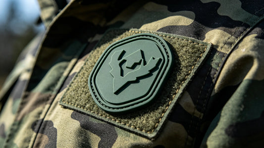
Olive drab, coyote brown, black, muted gray → rugged, tactical, outdoor neutrality
Fashion & Streetwear Patches
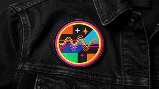
Black/red, navy/orange, neon accents, gold/black → bold, trendy, high visibility
Vintage & Collegiate Patches
Burgundy, cream, khaki, retro brown → classic, nostalgic, premium heritage style
Kids & Casual Merch
Bright clean tones, macaron pastels, balanced multi‑color palettes → friendly, playful

5. How Many Colors Should Your Patch Have?
Embroidered Patches
4–5 colors maximum recommended More colors increase stitching complexity, raise cost, and risk messy crowded details.
Woven & Printed Patches
6–8 colors acceptable These methods handle multi‑color layouts without losing clarity.
PVC & Leather Patches
3–6 colors ideal Clean solid color blocks look most premium on rubber and leather surfaces.
6. Common Color Deviation Causes & Fixes
1. Screen Color Difference
Cause: Digital displays over‑saturate or brighten colors. Fix: Always provide PMS codes instead of pictures.
2. Material Texture Interference
Cause: Thread texture makes colors look lighter/darker than flat digital designs. Fix: Trust physical thread color charts over screen previews.
3. Lighting Environment Difference
Cause: Indoor warm light vs outdoor daylight changes color perception. Fix: Inspect finished patches in natural daylight for final color confirmation.
4. Unclear Layer Separation
Cause: Similar tones touching each other blur outlines. Fix: Add a thin contrasting border to separate close colors.

7. Pro Tips for Perfect Patch Color Matching
- Always supply Pantone PMS numbers for every custom color.
- Avoid mixing too many high‑saturation bright colors in one small patch.
- Prioritize contrast over creative color experimentation for uniform patches.
- Match color tone consistency: warm with warm, cool with cool.
- For gradient or photo designs, always choose printed patches instead of embroidery.
- Request a pre‑production sample for high‑brand‑standard bulk orders.
Final Thoughts
Professional custom patch color matching is based on standardized Pantone PMS codes, material limitations, and contrast rules — not screen visuals. Understanding how threads, rubber, leather, and printed fabric render colors will help you avoid blurred details, washed‑out tones, and inconsistent batch colors.
Whether you are designing corporate uniforms, tactical morale patches, fashion merch, or vintage collegiate styles, choosing the right color palette ensures your patches look sharp, readable, and premium every time. Master these rules to elevate the quality of every custom patch order in your custom embroidered patches collection.

FAQ
Q: Are screen colors accurate for custom patch production?
A: No. Phone and monitor colors are unstable. Only Pantone PMS solid coated color codes guarantee accurate matching.
Q: What is the best color contrast for patch readability?
A: High‑contrast pairs like black/white, navy/gold, red/white, and dark gray/bright accents deliver the clearest results.
Q: Can embroidered patches do color gradients?
A: No. Embroidery only supports solid color blocks. Gradients and soft blending require printed sublimation patches.
Q: Do more colors on a patch increase cost?
A: Yes. Extra thread colors increase machine setup and production time, raising embroidery patch pricing.
Q: Why do my finished patches look darker/lighter than the mockup?
A: Thread texture, fabric base, and physical lighting create minor natural deviation. PMS color coding eliminates major color shifts.
Tags:
Previous
Custom Patch Backing Options 2026 | Full Guide to All Backing Types
Next
Custom Patch Stitch Density Guide 2026 | Low, Medium & High Density Differences