Custom Patch Color Matching Guide | Pantone Color Standard, Color Difference Causes & Accurate Color Selection Tips
Color deviation is the most frequent quality dispute in custom patch customization. Most customers confirm colors based on mobile phone or computer screen RGB display, unaware that digital screens use luminous color rendering while physical patches use material pigment color rendering. This fundamental difference leads to unavoidable visual gaps. Only by adopting industrial Pantone PMS solid color standards can factories achieve stable, unified and accurate color reproduction for brand logos, team emblems and commercial merchandise.
Custom 3D embroidered patches strictly adopts Pantone PMS international color standard for all custom orders, eliminating screen color deviation and ensuring consistent color tone for bulk batch patches.

Part 1: Core Difference Between RGB Screen Color & Pantone Physical Color
RGB Screen Color
Digital luminous color mode, used for electronic display only. Different phone brands, screen brightness, night mode and color temperature will change the same graphic color performance. Not suitable for factory physical production reference. All screen colors are for layout preview only, cannot be used as color confirmation basis.
Pantone PMS Solid Color
Global unified physical color standard for physical printing, textile and accessory production. Each color corresponds to an independent number, with fixed pigment ratio. All formal factories follow Pantone color cards for color matching, ensuring uniform color performance across different batches and production cycles.

Part 2: Main Causes Of Patch Color Difference
1. Screen Display Deviation
Mobile phone and computer screens enhance color saturation artificially, making preview colors brighter and more vivid than real physical patches, resulting in psychological color gap after receiving goods.
2. Embroidery Thread Color Limitation
Embroidery threads have fixed industrial color libraries, unable to achieve infinite gradient and ultra-similar fine color distinction. Extremely close similar colors on screen will be merged into the nearest available thread color.
3. Lighting Environment Influence
Patches look different under warm indoor light, cold LED light and outdoor natural sunlight. Warm light increases yellow tone, cold light enhances blue tone, causing visual color shift.
4. Fabric Base Color Influence
White twill, black twill and transparent base materials will slightly affect the final color presentation, leading to subtle background color penetration difference.
5. Manual Dyeing Batch Error
Mass thread dyeing has tiny permissible tolerance range, high-standard factories control batch color difference within invisible naked eye range.

Part 3: Craft Color Matching Capability Comparison
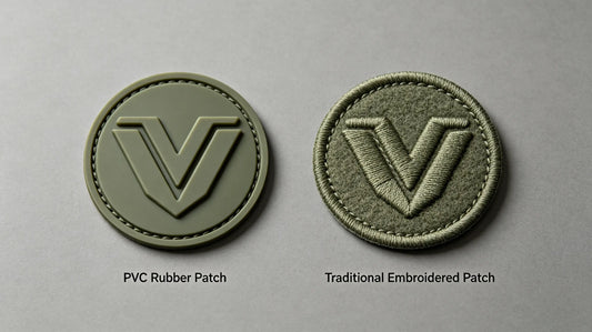
1. PVC Rubber Patches (Highest Color Accuracy)
100% Pantone color filling, adjustable pigment ratio, supports ultra-fine similar color distinction, zero grain difference, the best choice for strict brand color standard logos.
2. Woven Patches (Stable Color Reproduction)
Dyed yarn fixed color, high color fastness, consistent batch color tone, suitable for long-term repeated bulk order brand label production.
3. Embroidered Patches (Thread Color Limitation)
Rely on existing thread color library, can only approximate matching for ultra-special niche colors, unable to create custom dyed threads for single small orders.
4. Heat Transfer Patches (Rich Color Gradient)
Supports infinite gradient colors, but screen color deviation is more obvious; must rely on color swatch calibration for accurate brand color restoration.
Part 4: Industrial Standard Accurate Color Matching Process
-
Customer provides Pantone number (best solution)
Directly mark PMS color code for each color block, factory matches strictly according to physical color card, zero color difference risk.
-
Provide physical color sample reference
Send real product sample, factory calibrates thread and pigment according to physical object, most reliable for old batch reorder color consistency.
-
Screen draft for layout only, not color standard
Unified rule: screen image confirms pattern layout, size and position, Pantone card confirms final color tone.
-
Light environment double confirmation
Finished patches are inspected under natural daylight to avoid indoor light color shift error.

Part 5: Practical Tips To Avoid Color Deviation
- Never take mobile screenshot color as final production standard
- Prioritize Pantone color number marking for all official brand custom logos
- For ultra-strict color demand, choose PVC craft with highest color reduction capability
- Avoid overly saturated neon colors for embroidery, which are beyond thread color library range
- For repeat orders, retain old patch samples for batch color consistency comparison
Part 6: Common Color Matching Mistakes To Avoid
- Confirm color purely by phone screen → large saturation difference after production
- Request ultra-fine similar color distinction on embroidered patches → technical thread limitation leads to unavoidable approximation
- Ignore lighting difference and judge color under single indoor light → misjudge qualified patch as defective
- No color standard reserved for reorders → new batch color tone inconsistent with old products

Final Summary Core Rule
Screen for layout only, Pantone for final color; PVC for highest color accuracy, embroidery follows thread library; physical sample calibration eliminates batch difference; judge finished color under natural daylight; avoid screen saturation illusion.
Standard color matching process is the only way to achieve zero-deviation custom patch production.
Frequently Asked Questions
Q1: What is the most accurate color standard for custom patches?
A: Pantone PMS international solid color standard is the unified industrial production color benchmark.
Q2: Why do patches look different from phone screen pictures?
A: Screens use luminous RGB color while physical patches use pigment color, resulting in inherent deviation.
Q3: Which patch craft has the best color restoration effect?
A: PVC rubber patches achieve the most precise 1:1 Pantone color reproduction effect.
Q4: How to ensure consistent color for repeated patch reorders?
A: Reserve physical samples for factory color calibration to maintain batch color uniformity.
Tags:
Previous
Custom Patch Wholesale Reseller Guide | Sourcing Tips, Profit Margins, Inventory Planning & Hot Product Selection
Next
Custom Patch Size Guide | Standard Sizes, Design Proportions, Placement Sizing & Size Mistakes To Avoid