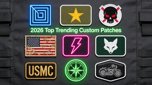
Custom Embroidered Patch Color Matching Guide: Rules, Palettes & Mistakes to Avoid
A perfect custom embroidered patch relies not only on exquisite craftsmanship and clear patterns but also on scientific color matching. Even with high-precision embroidery and creative design, poor color coordination will make patches look dull, disjointed from clothing, or lose visual hierarchy. Many custom patch failures stem from random color selection, insufficient contrast, and unreasonable color proportion collocation. Whether you design team uniforms, streetwear decorations, vintage merchandise, or corporate brand patches, mastering professional color matching rules can greatly improve the grade and recognition of finished patches. Before you order custom embroidered patches, learn these universal color matching principles to create harmonious, eye-catching, and high-level patch works.
Color matching for embroidered patches has unique industry particularities, different from plane graphic design. It needs to comprehensively consider thread color saturation, fabric background tone, embroidery stitch texture, and actual wearing scenarios. Too many colors cause messy vision; too few colors lead to monotonous effects; mismatched contrast makes patterns unclear. This guide systematically sorts out color matching basic rules, classic universal color palettes, fabric matching skills, and common error solutions, covering all design needs from minimalist daily style to trendy retro style.
1. Basic Color Matching Principles for Embroidered Patches
All high-level patch color designs follow three core principles: contrast clarity, color harmony, and scenario adaptability. These basic rules are the foundation to avoid failed color matching and are suitable for almost all custom patch styles and usage scenarios.
Core Color Matching Rules: • Ensure Sufficient Visual Contrast: The biggest premise of patch color matching is pattern identifiability. There must be obvious brightness or hue difference between the patch main pattern, outline color and background fabric to prevent the pattern from blending into the clothing background and becoming blurred and unrecognizable. • Control Total Color Quantity: For conventional custom patches, control the total color number within 3–5. Too many stacked colors will destroy the visual unity, make the patch messy and crowded, and also increase production difficulty and cost. • Grasp Color Proportion Hierarchy: Follow the 60-30-10 color proportion rule: 60% main dominant color, 30% auxiliary matching color, 10% decorative accent color. Clear primary and secondary relations ensure layered and orderly vision. • Unify Style Tone: Match color saturation with the design style. Low saturation colors suit minimalist, business, and vintage styles; high saturation bright colors suit streetwear, trend, and youth casual styles.
Pro Tip: When you custom embroidered patches for formal uniforms and corporate logos, prioritize low-saturation, high-unification color schemes to highlight professionalism and stability.

2. Four Classic Universal Patch Color Matching Schemes
Combined with color wheel theory and embroidery design characteristics, we summarize four most practical and never-out-of-date color matching schemes, covering mainstream styles such as business simplicity, trendy contrast, retro elegance, and fresh versatility, which can be directly applied to batch custom design.
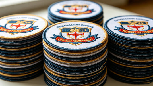
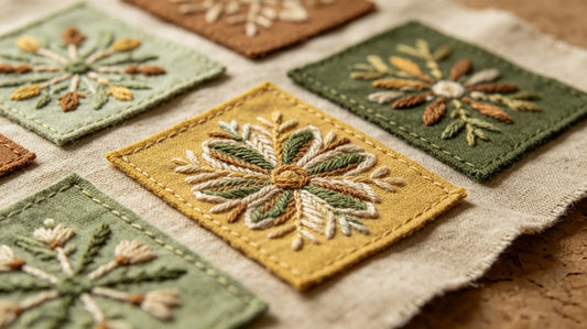
Classic Color Scheme Analysis: • Monochromatic Gradient Matching: Adopt different brightness and saturation changes of the same hue, such as dark blue + light blue + white. The color tone is unified and advanced, no mismatching risk, suitable for corporate, military, and formal team patches, with strong texture and low-key luxury. • Complementary Color Contrast Matching: Select two opposite colors on the color wheel for collocation, such as red & green, blue & orange, black & gold. Strong color contrast creates eye-catching visual effects, suitable for streetwear, sports teams, and event promotional patches. • Analogous Color Harmony Matching: Adjacent colors on the 12-color wheel are matched (such as blue, blue-green, violet-blue), with soft transition and natural harmony, avoiding rigid contrast, perfect for vintage casual and literary fashion patches. • Neutral Color Versatile Matching: Black, white, gray, beige, and khaki are matched with a single bright accent color. Neutral colors stabilize the overall tone, and bright colors enhance highlights, suitable for almost all clothing colors, with strong inclusiveness and fault tolerance.
Pro Tip: Complementary contrast colors are easy to appear tacky if not well controlled. It is recommended to use neutral color outlines for separation to improve advanced sense. When you order custom patches in batches, neutral + single accent color scheme is the safest and most cost-effective choice.

3. Targeted Matching by Fabric Background Color
The same patch color scheme will present completely different effects on different colored fabrics. Color matching must be combined with the actual background color of the clothing to ensure the patch is prominent and harmonious, avoiding integration or abruptness.
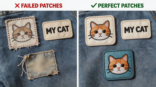
Fabric Background Color Matching Guide: • Dark Background (Black, Navy, Dark Gray, Dark Green): Prioritize high-brightness colors such as white, beige, gold, silver, light blue, and bright orange. Light-colored patterns form strong contrast on dark fabrics, with clear lines and outstanding layers. Avoid pure dark color matching, which will cause the patch to be completely integrated with the background and lose details. • Light Background (White, Beige, Light Gray, Khaki): Match with medium and low saturation dark colors such as navy, burgundy, dark gray, and olive green. Dark patterns are stable and atmospheric on light fabrics. Avoid excessive bright and high-saturation colors, which are easy to be dazzling and lack texture. • Color Background (Colorful Clothing): Take neutral colors (black, white, gray) as the main patch color, and reduce the number of decorative colors. Neutral patches can balance the lively background tone and keep the overall collocation clean and orderly.
Pro Tip: For multi-scene universal patches that need to adapt to both light and dark clothes, black or white thin outline design is the best choice to improve pattern recognition and background adaptability.

4. Style-Specific Exclusive Color Palettes
Different patch styles and usage scenarios have fixed exclusive color aesthetics. Targeted color matching according to style positioning can quickly improve the design sophistication and fit the scene temperament.
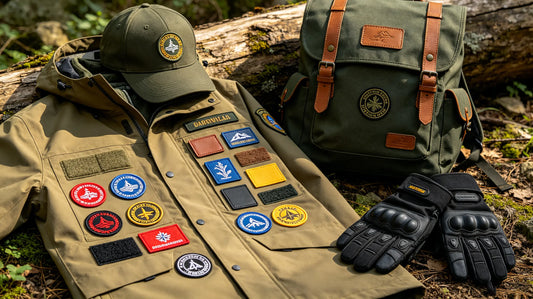
Style Color Palette Recommendations: • Formal Business & Corporate Style: Navy + gray + white, black + gold, dark green + beige. Low saturation, low contrast, stable and rigorous color tone, suitable for corporate uniforms, staff badges, and official team emblems. • Streetwear & Trendy Style: Black + red, navy + orange, dark gray + fluorescent green, gold + black. High contrast and partial bright color embellishment, fashionable and eye-catching, in line with street fashion aesthetics. • Vintage & Collegiate Style: Retro brown + cream white, burgundy + navy, khaki + dark green. Low saturation retro color system, soft and nostalgic, perfectly matching varsity jackets and vintage casual clothing. • Kids & Cute Style: Macaron blue, pink, light yellow, mint green. High brightness, low saturation macaron color matching, fresh and gentle, suitable for children’s clothing and casual decorative patches. • Tactical & Outdoor Style: Army green + black, khaki + gray, dark brown + beige. Earth color system with low visibility, practical and durable, fitting outdoor tactical and camping scene positioning.

5. Professional Color Matching Optimization Tips
On the basis of basic color schemes, these detailed optimization skills can further improve the advanced sense of patch color matching, avoid amateur problems, and make the finished product reach professional design level.
Advanced Color Optimization Tips: • Use Outline Color to Enhance Hierarchy: Add white, black, or gold thin outlines to complex patterns to separate overlapping color blocks, clarify pattern edges, and solve blurred details caused by similar colors. • Control Saturation Consistency: Do not mix high-saturation bright colors and low-saturation gray colors in large areas. Unified saturation of the whole patch ensures coordinated and advanced tone. • Partial Metallic Color Embellishment: Appropriate addition of gold and silver metallic threads in text or border positions can instantly improve the sense of luxury, without destroying the overall color harmony. • Reserve Blank Neutral Space: Do not fill all areas with colored threads. Appropriately retain blank or neutral color backgrounds to make the patch vision breathable and not crowded. • Avoid Excessive Fluorescent Colors: Fluorescent colors are highly decorative but poor in scene adaptability. Use them only for local embellishment and avoid large-area paving.
Pro Tip: When you custom embroidered patches with multi-color designs, you can ask the supplier for thread color cards to ensure that the actual thread color is consistent with the design draft and avoid color difference.
6. Common Color Matching Mistakes & Solutions
Most color failure problems of custom patches are caused by several common low-level mistakes. Avoiding these misunderstandings can greatly improve the success rate of customized finished products.
Common Mistakes & Fixes: • Mistake 1: Too Many Color Types: Exceeding 5 colors makes the patch messy and unhierarchical. Fix: Simplify the color scheme, retain only the main color and necessary auxiliary colors, and unify similar hues. • Mistake 2: Insufficient Background Contrast: The patch color is too close to the fabric background, resulting in unclear patterns. Fix: Increase the brightness difference or add high-contrast outline borders. • Mistake 3: Mixed Saturation Chaos: High-saturation and low-saturation colors are randomly matched, making the tone messy. Fix: Uniform overall saturation, take low saturation as the main tone and high saturation as local embellishment. • Mistake 4: Blind Use of Bright Colors: Large-area high-saturation bright colors are dazzling and tacky. Fix: Reduce the proportion of bright colors and match with neutral colors to stabilize the tone. • Mistake 5: Ignoring Thread Color Difference: Design draft colors are too idealized, inconsistent with actual embroidery thread colors. Fix: Refer to the actual thread color card for design and reserve color adjustment space.

7. Color Matching for Special Craft Patches
Special process patches such as 3D puff, chenille, metallic, and glow-in-the-dark have unique color presentation characteristics, and the color matching rules need to be adjusted accordingly to adapt to the craft texture.
Special Craft Color Tips: • 3D Puff Patches: Stereoscopic textures are more suitable for high-contrast color schemes. Dark main patterns + bright outlines can highlight the three-dimensional layering and avoid flat vision. • Chenille Patches: Soft plush texture is suitable for low-saturation retro color systems. Avoid overly bright and harsh colors to prevent conflict with gentle vintage texture. • Metallic Thread Patches: Metallic gold and silver are suitable for neutral dark backgrounds. A small amount of metallic color embellishment on dark tones can maximize the shiny advanced sense. • Glow-in-the-Dark Patches: The daytime color of luminous threads is soft and low-saturation. It is recommended to match dark background fabrics to ensure that the daytime pattern is clear and the night luminous effect is more contrasting.
Final Thoughts
Excellent color matching is the core key to improve the texture and recognition of custom embroidered patches. It is not blind color stacking, but scientific collocation based on color theory, fabric background, craftsmanship characteristics, and usage scenarios. Mastering the four classic color schemes, background matching rules, and style exclusive palettes can help you easily cope with various customized design needs, from formal business to trendy retro styles.
Reasonable color proportion, unified tone, sufficient contrast, and scenario adaptation are the four major criteria for high-level patch color matching. Avoiding common color mistakes and cooperating with professional process optimization can make every custom patch have harmonious color, distinct layers, and outstanding visual effects. When you are ready to order custom embroidered patches, follow this professional color matching guide to customize high-quality patches with both aesthetic feeling and practicality.
FAQ
Q:How many colors are best for custom embroidered patches?
A:For most conventional custom patches, 3–5 colors are the most suitable. This color quantity can ensure rich pattern layers without causing messy and crowded vision. Too few colors will make the design monotonous, while too many colors will increase production difficulty, cost, and destroy the overall color harmony. For minimalist styles, 2–3 colors are enough; for complex creative designs, appropriately increase colors but strictly control saturation and proportion. When you order custom embroidered patches, follow the principle of "few and fine" for color matching.
Q:How to make patches stand out on dark black clothes?
A:To make patches prominent on dark fabrics such as black and navy, prioritize high-brightness color matching schemes such as white, beige, gold, silver, and light blue. Adding white or bright-colored outline borders can further enhance pattern clarity and contrast. Avoid using dark colors such as black, dark gray, and dark brown, which will make the patch blend into the background and lose details. High contrast matching is the core of dark fabric patch design. When you custom patches for dark apparel, choose high-brightness main colors.
Q:What color scheme is the most advanced for vintage patches?
A:Low-saturation retro color palettes are the best choice for vintage patches, including burgundy & navy, khaki & dark green, cream white & retro brown, and muted gray & blue. These low-contrast, soft-tone color combinations fit the nostalgic and gentle vintage temperament, perfectly matching varsity jackets and retro casual clothing. Avoid high-saturation bright colors that will destroy the retro texture.
Q:Why do my custom patches look tacky after production?
A:Tacky patch effects are mostly caused by three reasons: excessive high-saturation bright colors without neutral color balance, too many messy color types, and insufficient color contrast leading to blurred layers. The solution is to reduce bright color proportion, add black, white, gray and other neutral colors for coordination, simplify redundant colors, and optimize color proportion hierarchy.
Q:Can metallic and luminous threads be matched with ordinary thread colors?
A:Yes, they can be perfectly matched. Metallic gold and silver are suitable for dark neutral backgrounds to highlight luxurious luster; glow-in-the-dark threads with soft low-saturation daytime colors are suitable for dark fabric matching, which ensures clear daytime patterns and brighter night luminous effects. Reasonable mixed color matching can enrich patch layers and create unique visual effects. When you order custom embroidered patches with special threads, professional color matching optimization is available.
Tags:
Previous
Metallic & Glow-in-the-Dark Embroidered Patches: Specialty Thread Guide & Design Tips
Next
12 Common Custom Embroidered Patch Mistakes & Practical Fixes for Perfect Results