Custom Embroidered Patch Design Details: Tips to Avoid Mistakes & Boost Quality
The difference between a good custom embroidered patch and a great one lies in the details. A well-designed patch with thoughtful attention to thread coverage, color selection, text size, and edge finishing will stand out, last longer, and perfectly capture your vision—whether it’s a brand logo, team crest, or personal DIY design. Too often, designers overlook small but critical details, leading to patches that look unprofessional, fade quickly, or fail to convey their intended message. This guide breaks down the essential design details for custom embroidered patches, shares common mistakes to avoid, and provides actionable tips to optimize your design for quality and impact. Before you order custom embroidered patches, let’s refine your design to ensure it’s polished, durable, and visually stunning.
Custom embroidered patches are a blend of art and craftsmanship—every detail, from the type of thread to the size of the text, impacts the final result. By focusing on the small but important elements, you can create a patch that not only looks great but also holds up to wear and tear, making it a lasting keepsake or effective branding tool. Whether you’re a beginner or an experienced designer, these design details will help you elevate your custom patch project.
1. Thread Coverage: The Foundation of a Polished Patch
Thread coverage is one of the most critical design details for custom embroidered patches—it determines how your design looks, how durable it is, and how well colors pop. Thread coverage refers to how much of the patch’s backing material is visible through the stitching, and it’s measured in percentages (50%, 75%, 100%). Choosing the right coverage for your design is key to achieving the desired look and functionality.
Thread Coverage Guide: • 50% Thread Coverage: Also known as “light coverage,” this option leaves half of the backing material visible. It’s ideal for subtle, minimalist designs, lightweight fabrics (e.g., cotton t-shirts), or patches that need a delicate, understated look. 50% coverage uses less thread, making it a budget-friendly choice for simple designs. • 75% Thread Coverage: The most versatile option, offering a balance between visibility and subtlety. It covers most of the backing, making colors vibrant while still maintaining a lightweight feel. 75% coverage works well for most designs, including corporate logos, team crests, and casual apparel patches. • 100% Thread Coverage: Also called “full coverage,” this option completely covers the backing material, creating a bold, vibrant look with no visible backing. It’s perfect for bold designs, large patches, or patches that will be used on dark fabrics (where backing visibility would be noticeable). 100% coverage is more durable and resistant to fading, making it ideal for high-wear items.
Pro Tip: When you custom embroidered patches, consult your supplier about thread coverage. They can recommend the best option based on your design, fabric type, and desired look—avoid overusing 100% coverage for small, simple designs, as it can make the patch feel bulky.

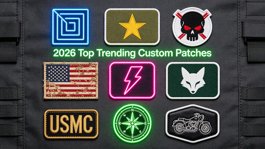
2. Color Selection: How to Choose Colors That Pop & Last
Color is a powerful tool in patch design—it conveys emotion, reinforces brand identity, and makes your patch stand out. However, choosing the wrong colors can lead to a patch that looks dull, clashes, or fades quickly. The key is to select colors that are vibrant, complementary, and compatible with embroidery thread limitations.
Color Selection Tips for Embroidered Patches: • Use Color-Fast Threads: Always opt for high-quality, color-fast polyester threads—they resist fading, bleeding, and discoloration, even after repeated washing and exposure to sunlight. Avoid low-quality threads that fade quickly, as this will ruin the patch’s appearance over time. • Choose Complementary Colors: Use complementary colors (e.g., blue and orange, red and green) to create contrast and make your design pop. For brand patches, stick to your brand’s color palette to maintain consistency and recognition. • Avoid Too Many Colors: While it’s tempting to use multiple colors, too many can make the patch look cluttered and increase production costs. Stick to 3–5 colors for most designs—focus on the most important elements (e.g., logo, text) and use neutral colors for background details. • Test Color Combinations: Request a digital mockup from your supplier to see how your color choices look together. This helps you avoid clashing colors or colors that are too similar (e.g., light gray and white) which can make details hard to see.
Pro Tip: When you order custom patches, ask your supplier for a thread color chart. This allows you to match your design’s colors to the exact thread shades available, ensuring your patch looks exactly as you envision.

3. Text Size & Font: Ensure Readability & Professionalism
Text is a common element in custom embroidered patches—whether it’s a brand name, team slogan, or important date. However, choosing the wrong text size or font can make the text unreadable, ruining the patch’s purpose. The key is to prioritize readability while maintaining a professional, cohesive look.
Text Design Tips for Embroidered Patches: • Minimum Text Size: For embroidered patches, the minimum readable text size is 8pt font. Text smaller than 8pt will be blurry or unreadable, as the stitching can’t capture small details. For small patches (1–2 inches), stick to 10pt font or larger. • Choose the Right Font: Opt for bold, simple fonts (e.g., Arial, Helvetica, Impact) for maximum readability. Avoid script, cursive, or overly decorative fonts—they are hard to embroider and can be difficult to read, especially for small text. • Leave Spacing Between Letters: Ensure there is enough spacing between letters (kerning) to prevent stitching from blending them together. Crowded text is unreadable and looks unprofessional. • Contrast Text with Background: Make sure the text color contrasts with the patch’s background color (e.g., white text on a dark background, black text on a light background). This ensures the text stands out and is easy to read from a distance.
Pro Tip: When you custom embroidered patches with text, share your font choice with your supplier. They can advise you on whether the font is suitable for embroidery and recommend adjustments if needed (e.g., increasing font size, simplifying the font).

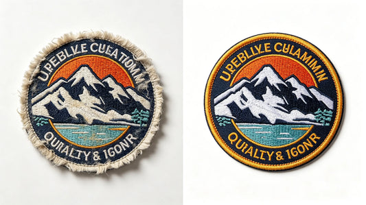
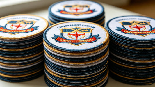
4. Edge Finishing: Elevate the Look & Durability
Edge finishing is often overlooked, but it plays a key role in the patch’s appearance and durability. The right edge finish can make your patch look polished and professional, while the wrong one can lead to fraying, unraveling, or a messy appearance. There are two main edge finishing options for custom embroidered patches: merrowed edge and heat-cut edge.
Edge Finishing Options: • Merrowed Edge: A classic, polished finish where the edge of the patch is stitched (merrowed) with a thick thread, creating a smooth, rounded edge. Merrowed edges are ideal for circular, oval, or simple-shaped patches and add durability by preventing fraying. They have a traditional, high-quality look, making them perfect for corporate logos, team crests, and vintage-style patches. • Heat-Cut Edge: A modern finish where the patch is cut to the exact shape using heat, creating a clean, sharp edge. Heat-cut edges are ideal for custom-shaped patches (e.g., mascot shapes, irregular logos) that can’t be merrowed. They have a sleek, contemporary look and work well for streetwear, DIY projects, and bold, unique designs.
Pro Tip: When you order custom patches, choose the edge finish based on your patch’s shape and style. Merrowed edges are best for simple shapes and a classic look, while heat-cut edges are perfect for custom shapes and a modern aesthetic.
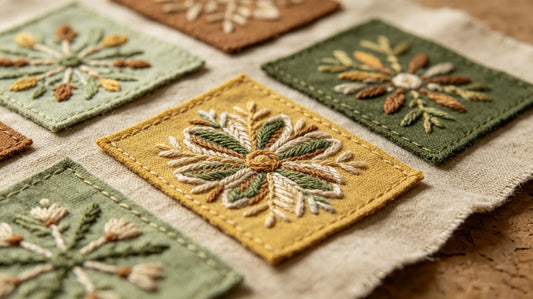
5. Stitch Density: Balance Detail & Durability
Stitch density refers to how many stitches are used per square inch of the patch—it impacts both the patch’s detail and durability. Too few stitches can make the patch look sparse, with visible backing and fuzzy details. Too many stitches can make the patch bulky, stiff, and prone to unraveling. Finding the right balance is key to creating a high-quality patch.
Stitch Density Guidelines: • High Stitch Density (12–15 stitches per inch): Ideal for detailed designs (e.g., small text, intricate logos) that require crisp, clear details. High stitch density creates a smooth, polished look and is more durable, making it perfect for high-wear items like uniforms and tactical gear. • Medium Stitch Density (8–11 stitches per inch): The most versatile option, suitable for most designs. It balances detail and flexibility, making it ideal for casual apparel, hats, and DIY projects. Medium stitch density is cost-effective and works well for both simple and slightly detailed designs. • Low Stitch Density (5–7 stitches per inch): Best for large, simple designs (e.g., solid color patches, large logos) where detail is not a priority. Low stitch density uses less thread, making it budget-friendly, but it may be less durable and have visible backing.
Pro Tip: When you custom embroidered patches, your supplier will adjust the stitch density based on your design. For detailed designs, request high stitch density; for simple designs, medium or low density is sufficient.

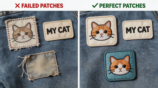
6. Common Design Mistakes to Avoid (And How to Fix Them)
Even the most experienced designers make mistakes when creating custom embroidered patches. These common mistakes can ruin the patch’s appearance, durability, or readability—but they’re easy to avoid with a little planning and attention to detail.
Common Design Mistakes & Fixes: • Mistake 1: Using Too Small Text: Small text (under 8pt) is unreadable in embroidery. Fix: Increase text size to 8pt or larger, or use a simpler font to improve readability. • Mistake 2: Overcomplicating the Design: Intricate designs with too many details, colors, or small elements can be hard to embroider and look cluttered. Fix: Simplify the design by removing unnecessary details, focusing on the core elements (e.g., logo, text). • Mistake 3: Choosing Clashing Colors: Colors that are too similar or clash can make the patch look unprofessional. Fix: Use complementary colors, test color combinations with a digital mockup, and stick to 3–5 colors. • Mistake 4: Ignoring Thread Coverage: Using the wrong thread coverage (e.g., 50% coverage for a dark fabric) can make the patch look dull or incomplete. Fix: Consult your supplier to choose the right coverage for your design and fabric. • Mistake 5: Forgetting Edge Finishing: A poorly finished edge can lead to fraying and a messy appearance. Fix: Choose the right edge finish (merrowed or heat-cut) based on your patch’s shape and style.
7. How to Optimize Your Design for Embroidery (Step-by-Step)
Optimizing your design for embroidery ensures that your patch looks great, is durable, and is easy to produce. Follow these steps to refine your design before placing your order.
Step-by-Step Design Optimization Guide: • Step 1: Simplify Your Design: Remove unnecessary details, reduce the number of colors, and focus on the core elements (e.g., logo, text). Embroidery works best with bold, simple designs. • Step 2: Choose the Right Thread Coverage: Based on your design, fabric, and desired look, select 50%, 75%, or 100% thread coverage. • Step 3: Select Readable Text: Use 8pt font or larger, choose a bold, simple font, and ensure text contrasts with the background. • Step 4: Pick Complementary Colors: Use color-fast polyester threads, stick to 3–5 colors, and test combinations with a digital mockup. • Step 5: Choose the Right Edge Finish: Select merrowed edge for simple shapes, heat-cut edge for custom shapes. • Step 6: Consult Your Supplier: When you custom embroidered patches, share your design with your supplier. They can provide feedback, optimize the design for embroidery, and create a digital mockup for your approval.
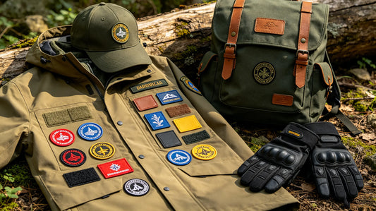
8. Design Tips for Specific Patch Uses
The best design details vary depending on how the patch will be used. Tailoring your design to your patch’s intended use ensures it looks great and functions well.
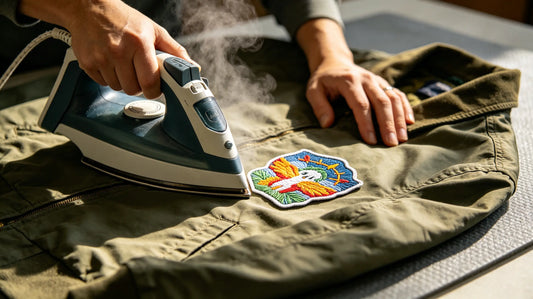
Design Tips by Use Case: • Brand Logos: Use 75–100% thread coverage for vibrancy, stick to your brand color palette, and use bold, readable text. Merrowed edge for a professional look. • Team Patches: Use bold colors and large text (team name, logo), high stitch density for durability, and merrowed edge for a classic look. 3D puff embroidery can add a tactile, eye-catching effect. • DIY & Streetwear Patches: Use custom shapes (heat-cut edge), bold colors, and unique designs. Medium stitch density for flexibility, and consider metallic or glow-in-the-dark threads for extra flair. • Promotional Patches: Keep the design simple, use 50–75% thread coverage for cost savings, and include clear, readable text (brand name, event date). Peel & stick or iron-on backing for easy application.

Final Thoughts
Custom embroidered patch design is all about the details. By focusing on thread coverage, color selection, text size, edge finishing, and stitch density, you can create a patch that is polished, durable, and visually stunning. Avoiding common design mistakes and optimizing your design for embroidery ensures that your patch meets your vision and stands the test of time—whether it’s for branding, team unity, or personal use.
Remember, your supplier is your best resource for design optimization. They have the expertise to help you refine your design, choose the right specifications, and ensure your patch is of the highest quality. When you’re ready to order custom embroidered patches, use this guide to create a design that is both beautiful and functional, making a lasting impression on anyone who sees it.
FAQ
Q:What is the minimum text size for readable custom embroidered patches?
A:The minimum readable text size for custom embroidered patches is 8pt font. Text smaller than 8pt will be blurry or unreadable, as embroidery stitching cannot capture small details effectively. For small patches (1–2 inches), we recommend using 10pt font or larger to ensure readability. When you order custom embroidered patches with text, your supplier can advise you on the best font size for your patch’s size and design.
Q:Which thread coverage is best for my custom patch?
A:The best thread coverage depends on your design, fabric, and desired look. 50% coverage is ideal for minimalist designs and lightweight fabrics; 75% coverage is versatile and works for most designs; 100% coverage is perfect for bold designs and dark fabrics (no visible backing). When you custom patches, your supplier can recommend the right coverage based on your specific needs.
Q:Can I use script or cursive fonts for embroidered patch text?
A:While you can use script or cursive fonts, they are not recommended for embroidered patches—especially for small text. Script fonts have thin, intricate lines that are hard to embroider, leading to blurry or unreadable text. For best results, use bold, simple fonts (e.g., Arial, Helvetica) that are easy to stitch and read. If you prefer a script font, use a larger font size (12pt or more) to ensure readability.
Q:What’s the difference between merrowed edge and heat-cut edge patches?
A:Merrowed edge patches have a smooth, rounded edge stitched with thick thread, ideal for simple shapes (circles, ovals) and a classic look. Heat-cut edge patches are cut to the exact custom shape using heat, creating a sharp, modern edge—perfect for irregular or unique shapes. When you custom embroidered patches, choose the edge finish based on your patch’s shape and style.
Q:How many colors should I use for my custom embroidered patch?
A:We recommend using 3–5 colors for most custom embroidered patches. Too many colors (6+) can make the patch look cluttered, increase production costs, and make it harder to embroider. Focus on the most important elements (e.g., logo, text) and use neutral colors for background details. When youorder custom patches, your supplier can help you select a cohesive color palette that works well for embroidery.
Tags:
Previous
Custom Embroidered vs. Woven vs. PVC Patches: Which Is Best for Your Project?
Next
Custom Embroidered Patch Backing Types: How to Choose the Right One for Your Project