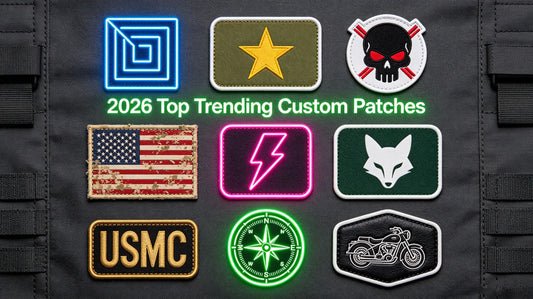
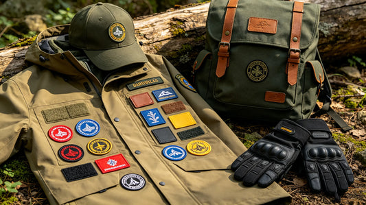
Common Custom Embroidered Patch Design Mistakes & Solutions: A Beginner’s Guide to Avoid Pitfalls
Designing custom embroidered patches is an exciting process—whether you’re creating patches for personal style, team gear, or brand promotion—but it’s easy for beginners to make mistakes that ruin the final product. From overly complex details that don’t translate to stitching, to poor color choices that fade or clash, these common errors can turn a great idea into a disappointing patch. Before you order custom embroidered patches, this guide will break down the most frequent design mistakes, explain why they happen, and share simple solutions to fix them—helping you create polished, professional patches on your first try.
Even experienced designers make occasional mistakes, but by learning to recognize and avoid these common pitfalls, you can save time, money, and frustration. Whether you’re designing your first patch or looking to refine your skills, these tips will help you create patches that look great, stand out, and meet your needs—whether for personal use or professional goals.
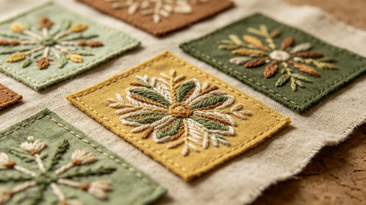
1. Mistake #1: Overly Complex Designs with Tiny Details
One of the most common mistakes beginners make is designing patches with overly complex details, tiny text, or intricate patterns that can’t be replicated with embroidery thread. Embroidery has limitations—small details (e.g., text smaller than 0.25 inches, fine lines, or complex gradients) will blur, fray, or disappear entirely during production.
Why It’s a Problem: Tiny details and complex patterns require extremely small stitches, which are difficult to execute consistently. This leads to a messy, unprofessional look, and the original design intent is lost. For example, a patch with tiny text may be unreadable, or a complex logo with multiple small elements may look cluttered and blurry.
Solution: Simplify your design. Remove unnecessary details, enlarge small text (aim for at least 0.5 inches tall), and use bold, clean lines. If you have a complex logo, work with your supplier to simplify it—focus on the core elements that make the logo recognizable. When you custom embroidered patches, ask your supplier for a design mockup to ensure your simplified design still captures your vision.
Pro Tip: Use negative space to your advantage—simplifying details can make your design more impactful. For example, instead of a detailed illustration, use a bold outline to create a recognizable shape.

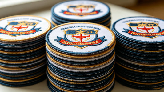
2. Mistake #2: Poor Color Choices (Clashing, Fading, or Low Contrast)
Color is a critical part of patch design, but beginners often choose colors that clash, fade easily, or lack contrast—making the patch hard to see or unappealing to the eye. Common color mistakes include using too many colors, choosing colors that are too similar (low contrast), or selecting light colors that fade quickly in sunlight or after washing.
Why It’s a Problem: Clashing colors make the patch look unprofessional and hard to look at. Low contrast (e.g., light gray text on a white background) makes details hard to read or distinguish. Light, pastel colors may fade quickly, especially if the patch is worn outdoors or washed frequently.
Solution: Stick to 3–5 core colors (as we recommended in earlier guides) and use high-contrast color pairs (e.g., black text on a white background, dark blue on a light gray background). Choose vibrant, durable thread colors (polyester is more fade-resistant than rayon) and avoid overly light pastels for patches that will be exposed to sunlight or frequent washing. When you order custom patches, ask your supplier for color samples to verify how the colors will look in embroidery thread.
Pro Tip: Use a color wheel to choose complementary colors (colors opposite each other on the wheel) for a bold, eye-catching look, or analogous colors (colors next to each other) for a cohesive, subtle look.

3. Mistake #3: Ignoring Embroidery Stitch Limitations
Beginners often design patches without considering the limitations of embroidery stitches—for example, using gradients, fine lines, or solid blocks of color that are difficult to replicate with stitching. Embroidery uses discrete stitches, so smooth gradients, tiny lines, or large solid areas can look uneven or messy.
Why It’s a Problem: Gradients are nearly impossible to replicate with embroidery thread (each stitch is a single color), so they will look choppy or discolored. Fine lines (thinner than 0.05 inches) may break or fray, and large solid blocks of color can look uneven if the stitches are not spaced properly.
Solution: Avoid gradients—use solid colors or simple color blocks instead. For fine lines, thicken them to at least 0.08 inches to ensure they hold up during stitching. For large solid areas, use a fill stitch (e.g., satin stitch, cross stitch) that distributes stitches evenly, or break the area into smaller sections with subtle color variations to add texture. When you custom embroidered patches, consult your supplier about the best stitch types for your design.
Pro Tip: Use stitch types strategically—satin stitch works well for small, smooth areas, while cross stitch is great for texture, and outline stitches help define edges clearly.

4. Mistake #4: Choosing the Wrong Patch Size for the Design
Another common mistake is choosing a patch size that doesn’t match the design. For example, a large, complex design on a small patch (1–2 inches) will be cramped and unreadable, while a small, simple design on a large patch (4+ inches) will look empty and unbalanced.
Why It’s a Problem: The size of your patch directly impacts how well the design translates. A design that’s too big for the patch will be cropped or distorted, while a design that’s too small will lack detail and impact. This can make the patch look unprofessional and defeat its purpose (e.g., a brand patch that’s too small to be recognizable).
Solution: Match the patch size to the complexity of your design. Small patches (1–2 inches) work best for simple designs (e.g., a small logo, initials, or a simple icon). Medium patches (2–4 inches) are versatile and work well for most designs, including logos and text. Large patches (4+ inches) are ideal for complex designs with multiple elements (e.g., a detailed illustration or a large logo). When you order custom patches, ask your supplier for size recommendations based on your design.
Pro Tip: Create a mockup of your design at different sizes to see which one looks best—this will help you choose the perfect patch size for your vision.

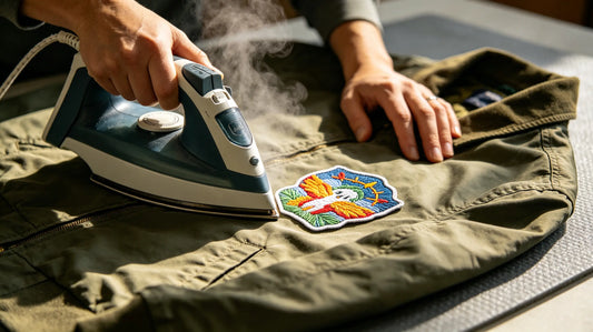
5. Mistake #5: Forgetting About Edge Finishing & Backing Compatibility
Beginners often focus on the front design but forget about edge finishing and backing type—two critical elements that impact the patch’s durability and appearance. Choosing the wrong edge finishing (e.g., a heat-cut edge for a complex, irregular shape) or backing type (e.g., iron-on for a leather jacket) can ruin the patch.
Why It’s a Problem: The wrong edge finishing can cause fraying (e.g., a heat-cut edge on a patch with jagged edges) or make the patch look unpolished (e.g., a merrowed edge on a small, simple shape). The wrong backing type can lead to the patch peeling off (e.g., iron-on on leather) or being difficult to apply (e.g., sew-on on a delicate fabric).
Solution: Choose edge finishing based on your design’s shape: merrowed edges (rolled, stitched) work best for simple, rounded shapes (e.g., circles, squares), while heat-cut edges (clean, precise) are better for complex, irregular shapes (e.g., custom logos with jagged edges). Choose backing type based on your use case: iron-on for easy application on cotton/polyester fabrics, sew-on for durability (especially for frequently washed items), hook & loop for removable patches, and adhesive for temporary use. When youcustom embroidered patches, discuss edge finishing and backing options with your supplier to ensure compatibility.
Pro Tip: If you’re unsure about edge finishing or backing, order a small sample to test how it looks and performs on your intended item.
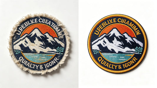
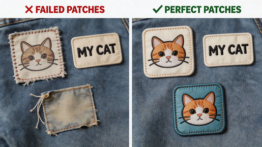
6. Mistake #6: Not Testing a Design Mockup Before Production
Many beginners skip testing a design mockup and proceed directly to production—this is a costly mistake. A digital mockup or physical sample lets you see how the design will look as a patch, allowing you to catch errors (e.g., blurry text, clashing colors) before placing a bulk order.
Why It’s a Problem: Without a mockup, you risk receiving a bulk order of patches that don’t match your vision—e.g., text that’s unreadable, colors that are different from what you expected, or details that are lost in stitching. This leads to wasted time, money, and frustration.
Solution: Always request a digital mockup from your supplier before production—this is usually free and lets you review the design, size, colors, and details. For critical orders (e.g., bulk brand patches), order a physical sample to see the stitching quality, color accuracy, and edge finishing firsthand. When youorder custom embroidered patches, a mockup or sample is a small step that prevents costly mistakes.
Pro Tip: Review the mockup carefully—check for typos, color accuracy, and detail clarity. If something doesn’t look right, ask your supplier to make adjustments before moving forward.

7. Mistake #7: Overcrowding the Design with Too Many Elements
Beginners often try to include too many elements (text, icons, illustrations) in their patch design, leading to a cluttered, overwhelming look. Overcrowding makes the patch hard to read, less visually appealing, and difficult to replicate with embroidery.
Why It’s a Problem: A cluttered design lacks focus—viewers won’t know what to look at first. Too many elements also mean more stitches, which can increase production costs and lead to a messy, unpolished finish. For example, a patch with multiple icons, lines of text, and a background pattern will look chaotic and hard to understand.
Solution: Prioritize the most important elements of your design—e.g., a logo and a short slogan, or a single icon. Remove any elements that don’t add value or distract from the core message. Use spacing to separate elements and create a clean, balanced look. When you custom patches, remember that less is often more— a simple, focused design is more impactful than a cluttered one.
Pro Tip: Use a grid to arrange elements evenly—this helps create balance and prevents overcrowding. Focus on one core message or visual element to make your patch memorable.
8. Mistake #8: Using Low-Resolution Design Files
Using low-resolution design files (e.g., blurry JPEGs, small PNGs) is a common mistake that leads to poor-quality patches. Low-resolution files cause the design to look pixelated, blurry, or distorted when scaled up for embroidery.
Why It’s a Problem: Embroidery machines need high-resolution files to accurately replicate the design. Low-resolution files lack the detail needed for clean stitching, leading to a patch that looks unprofessional and blurry. For example, a blurry logo file will result in a patch with jagged edges and unclear details.
Solution: Use high-resolution design files (e.g., AI, EPS, high-quality PNGs with a resolution of 300 DPI or higher). If you only have a low-resolution file, ask your supplier to help you vectorize it (convert it to a high-resolution, scalable file). When you custom embroidered patches, providing high-resolution files ensures the design is crisp and clear.
Pro Tip: Save your design files in multiple formats (AI, EPS, PNG) to ensure your supplier can use them—this avoids delays and ensures the design translates well to embroidery.
Final Thoughts
Designing custom embroidered patches doesn’t have to be stressful—by avoiding these common mistakes and following the simple solutions, you can create polished, professional patches that meet your needs. Whether you’re a beginner or looking to refine your design skills, remember to simplify your design, choose the right colors and size, consider embroidery limitations, test a mockup, and use high-resolution files.
Your supplier is your best resource—they have the expertise to help you avoid these mistakes and optimize your design for embroidery. Don’t be afraid to ask for guidance, whether you’re unsure about color choices, edge finishing, or design simplification. When you’re ready to order custom embroidered patches, use this guide to create a design that’s visually appealing, durable, and perfectly aligned with your vision.
FAQ
Q:Why do my custom patch designs look blurry when embroidered?
A:Blurry patches are usually caused by two common mistakes: using low-resolution design files or including overly complex, tiny details. Ensure your design files are high-resolution (300 DPI or higher, AI/EPS/PNG format) and simplify small details (enlarge text to at least 0.5 inches). When you order custom embroidered patches, ask your supplier to review your file and suggest simplifications if needed.
Q:How many colors should I use in my custom patch design?
A:It’s best to stick to 3–5 core colors. Using more than 5 colors can make the patch look cluttered, increase production costs, and make it harder to replicate with embroidery. Choose high-contrast color pairs to ensure details are visible, and avoid gradients (which are difficult to embroider). Focus on colors that align with your brand or vision for the most impact.
Q:What’s the best patch size for a beginner’s design?
A:Medium patches (2–4 inches) are the best for beginners—they’re versatile and work well for most simple to moderately complex designs. Small patches (1–2 inches) are great for very simple designs (e.g., initials, small icons), while large patches (4+ inches) are better for more complex designs. When you custom patches, your supplier can recommend the perfect size based on your design’s complexity.
Q:Should I order a mockup before my custom patch order?
A:Yes, ordering a digital mockup is highly recommended—most suppliers offer this for free. A mockup lets you see how your design will look as a patch, allowing you to catch errors (e.g., blurry text, clashing colors) before production. For bulk or critical orders, a physical sample is even better, as it lets you test stitching quality and color accuracy firsthand.
Q:What’s the difference between merrowed and heat-cut edges for custom patches?
A:Merrowed edges are rolled, stitched edges that work best for simple, rounded shapes (e.g., circles, squares)—they’re durable and give the patch a classic look. Heat-cut edges are clean, precise edges that are ideal for complex, irregular shapes (e.g., custom logos with jagged edges)—they’re more modern and avoid fraying. When you order custom embroidered patches, choose the edge finishing that matches your design’s shape and aesthetic.
Tags:
Previous
How to Choose a Reliable Custom Embroidered Patch Supplier: A Complete Guide for Cross-Border Purchasing
Next
Custom Embroidered Patch Materials & Craftsmanship: Choose the Right Options to Enhance Patch Quality