Custom Embroidered Patch Design Optimization Tips: Elevate Simple Designs to High-Quality
You don’t need a complex, intricate design to create stunning custom embroidered patches—some of the most eye-catching, professional patches start with a simple concept. The key to making a simple design stand out lies in optimization: refining details, enhancing texture, and ensuring the design translates seamlessly to embroidery. Whether you’re a beginner designing your first patch or a brand looking to simplify your logo for patches, these optimization tips will help you elevate your simple design to look polished, high-quality, and memorable. Before you order custom embroidered patches, this guide will break down practical, easy-to-follow optimization techniques that work for any simple design—no advanced design skills required.
Many people mistakenly believe that “simple” means “basic” or “unprofessional” when it comes to patch design. But the truth is, simple designs are often more versatile, easier to replicate with embroidery, and more memorable than overcrowded ones. With the right optimization, a simple logo, icon, or text can become a high-quality patch that stands out on jackets, hats, bags, and uniforms. The goal is to focus on clarity, texture, and balance—three elements that turn a simple design into something exceptional.
1. Start with a Clean, Minimal Design Foundation
The first step in optimizing your patch design is to ensure your base design is clean and minimal. Simple designs work best for embroidery because they’re easier to replicate with stitches, avoid blurriness, and maintain clarity even in small sizes. A cluttered design—even if it’s “simple” in concept—can look messy when embroidered, so focus on the core element of your design and remove any unnecessary details.
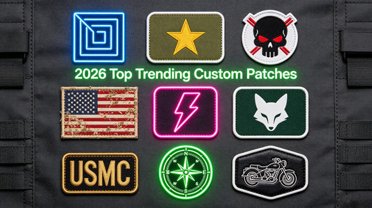
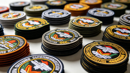
Key Tips for a Clean Foundation: • Focus on One Core Element: Whether it’s a logo, icon, or short text, stick to one main element. For example, a simple brand logo without extra decorative elements, or a single icon (e.g., a star, heart, or team symbol) works better than a design with multiple overlapping elements. • Use Bold, Clean Lines: Replace thin, fragile lines with bold, thick lines (at least 0.08 inches) to ensure they hold up during embroidery. Thin lines can fray or break, making the design look unpolished. • Avoid Tiny Details: Small details (e.g., tiny text, intricate patterns) will blur during embroidery, even in larger patches. Remove or simplify these details to keep the design clean and readable. • Choose a Simple Shape: Opt for simple, rounded shapes (circle, square, oval) for the patch itself—this complements a simple design and makes edge finishing (merrowed or heat-cut) easier and more polished.
Pro Tip: When you custom embroidered patches, your supplier’s design team can help you simplify your base design—many offer free design tweaks to ensure your simple concept translates well to embroidery.

2. Optimize Color Choices for Clarity & Impact
Color is one of the easiest ways to elevate a simple patch design. Even a single-color design can look high-quality with the right color choice, while a two- or three-color design can gain depth and impact with strategic color pairing. The goal is to choose colors that enhance the design’s clarity, stand out against the patch base, and align with your brand or vision.
Color Optimization Tips: • Stick to 1–3 Colors: For simple designs, 1–3 colors are ideal. More than 3 colors can make the design look cluttered, even if the design itself is minimal. A single bold color (e.g., red on a white patch) can be just as impactful as multiple colors. • Use High-Contrast Pairs: High-contrast colors (e.g., black on white, dark blue on light gray, red on black) make the design stand out and ensure details are visible. Avoid low-contrast pairs (e.g., light gray on white, pastel pink on beige) which can make the design look washed out. • Choose Durable, Vibrant Thread Colors: Opt for polyester thread (the most fade-resistant and durable option) in vibrant shades. This ensures your patch looks bright and fresh even after frequent washing or outdoor wear. • Use Color to Highlight Key Details: If your simple design has one key detail (e.g., a small icon within a logo), use a contrasting color to make it pop. For example, a white logo with a red accent line draws the eye to the core element.
Pro Tip: When you order custom patches, ask your supplier for color samples to test how your chosen colors will look in embroidery thread—this ensures you get the vibrancy and contrast you want.

3. Enhance Texture with Strategic Embroidery Stitches
Even a simple design can gain depth and质感 (texture) with the right embroidery stitches. Stitches are more than just a way to create the design—they’re a tool to add dimension, making your patch look more professional and tactile. You don’t need complex stitching techniques; even basic stitches can elevate a simple design when used strategically.
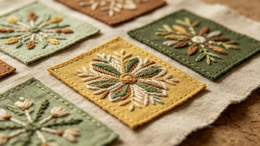
Stitch Optimization Tips for Simple Designs: • Use Satin Stitch for Smooth Areas: Satin stitch creates a dense, smooth finish that’s perfect for filling in simple shapes (e.g., a circle, square, or logo outline). It adds a polished, luxurious look without complicating the design. • Add Outline Stitches for Definition: A thin outline stitch (e.g., running stitch or backstitch) around the edges of your design adds definition, making it stand out from the patch base. This is especially helpful for single-color designs. • Use 3D Puff Stitch for Subtle Depth: If you want to add a subtle 3D effect without overcomplicating the design, use 3D puff stitch on one small element (e.g., a logo icon). This adds texture without making the design look cluttered. • Avoid Overly Complex Stitches: Stick to basic stitches (satin, outline, flat) for simple designs—complex stitches (e.g., cross-stitch, chain stitch) can make the design look busy and take away from its minimal appeal.
Pro Tip: When you custom embroidered patches, consult your supplier about the best stitches for your simple design. Most suppliers can recommend stitch types that enhance texture without adding complexity.

4. Optimize Text for Readability (If Including Text)
Many simple patch designs include text (e.g., a brand name, team initials, or short slogan). The key to optimizing text is to ensure it’s readable—even in small patch sizes. Poorly optimized text can ruin an otherwise great simple design, so follow these tips to keep text clear and professional.
Text Optimization Tips: • Choose a Bold, Simple Font: Avoid script, cursive, or overly decorative fonts—these are hard to replicate with embroidery and can be unreadable in small sizes. Opt for bold, sans-serif fonts (e.g., Arial, Helvetica) that are easy to stitch and read. • Enlarge Text to At Least 0.5 Inches: Text smaller than 0.5 inches will blur during embroidery. Even in small patches (1–2 inches), keep text size at 0.5 inches or larger to ensure readability. • Use Solid Thread for Text: Avoid gradient or metallic thread for text (unless it’s a small accent)—solid, bold thread colors (e.g., black, white, red) make text easier to read. • Add Spacing Between Letters: Crowded letters will blur together. Add a small amount of spacing (0.05–0.1 inches) between letters to ensure each character is distinct.
Pro Tip: If your text is too small to be readable, simplify it—use initials instead of a full name, or a short slogan instead of a long phrase. When you custom embroidered patches, your supplier can test the text size and font to ensure readability.
5. Match Design to Patch Size & Placement
A simple design can look great in one size but awkward in another—optimizing your design means matching it to the patch size and intended placement. The same simple design will need different tweaks for a small hat patch versus a large jacket back patch, so consider size and placement early in the optimization process.
Size & Placement Optimization Tips: • Small Patches (0.5–2 inches): Keep the design extremely simple—one icon or a few letters. Avoid any extra details, and use bold lines and high-contrast colors to ensure visibility. • Medium Patches (2–4 inches): You can add a small amount of detail (e.g., a subtle outline or accent color) to a simple design. Ensure text is at least 0.5 inches, and keep the core element centered for balance. • Large Patches (4+ inches): A simple design can be expanded slightly (e.g., a larger icon or text) to fill the space without looking empty. Add subtle texture (e.g., satin stitch filling) to prevent the design from looking flat. • Placement Considerations: For hats or sleeves (small areas), keep the design compact and centered. For jacket chests or backs (larger areas), ensure the design is proportional and not too small or too large.
Pro Tip: Create a mockup of your design at the intended patch size to see how it looks. When you order custom patches, most suppliers offer free digital mockups, so you can test different sizes before finalizing your design.

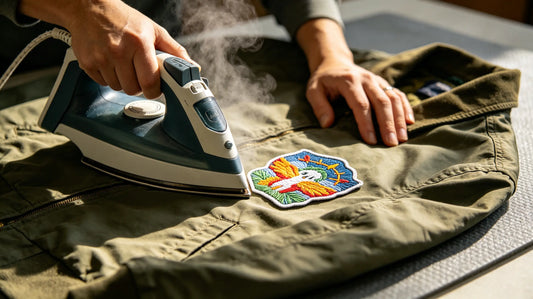
6. Optimize Edge Finishing to Complement the Design
Edge finishing is often overlooked, but it’s a key part of optimizing a simple design. The right edge finishing can enhance the design’s polish, while the wrong one can make it look unprofessional. For simple designs, edge finishing should be clean and subtle—letting the design itself be the focus.
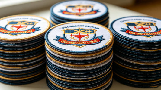
Edge Finishing Optimization Tips: • Simple, Rounded Shapes: Use a merrowed edge for simple, rounded shapes (circle, square, oval). Merrowed edges are smooth, durable, and give the patch a classic, polished look that complements simple designs. • Irregular or Custom Shapes: Use a heat-cut edge for simple custom shapes (e.g., a simple icon shape). Heat-cut edges are clean and precise, ensuring the shape of the patch matches the design without adding extra bulk. • Avoid Overly Decorative Edges: For simple designs, avoid decorative edges (e.g., scalloped, fringed)—these can distract from the design and make it look cluttered. • Match Edge Color to Design: Choose an edge color that complements your design (e.g., black edge for a black-and-white design, or a color that matches the accent color of your design) for a cohesive look.
Pro Tip: When you custom embroidered patches, discuss edge finishing with your supplier—they’ll help you choose an option that complements your simple design and ensures a polished look.
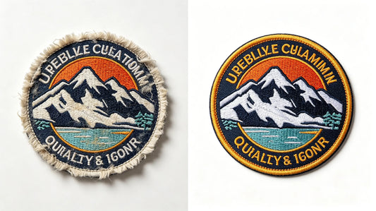
7. Test & Tweak with a Mockup
The final step in optimizing your simple patch design is to test it with a mockup. A digital or physical mockup lets you see how the design will look as a patch, allowing you to catch small issues (e.g., blurry text, low contrast, awkward spacing) before production. This is a small step that can save you time, money, and frustration.
Mockup Testing Tips: • Review Clarity: Check if all elements of the design are clear and readable, especially text and small details. • Test Color Contrast: Ensure the design stands out against the patch base and that colors look vibrant. • Check Proportion: Make sure the design is proportional to the patch size and that no elements are too large or too small. • Ask for Feedback: If you’re unsure, ask your supplier or a colleague for feedback—fresh eyes can catch issues you might miss.
Pro Tip: Most suppliers, including our trusted partner, offer free digital mockups and unlimited revisions. When you order custom embroidered patches, take advantage of this to tweak your design until it’s perfect.

Common Design Optimization Mistakes to Avoid
Even with the right tips, it’s easy to make small mistakes when optimizing a simple patch design. Avoid these common pitfalls to ensure your design looks polished and high-quality:
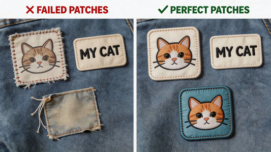
• Overcomplicating the Design: Adding too many details, colors, or stitches to a simple design defeats the purpose—keep it minimal and focused. • Ignoring Readability: Choosing a small font or low-contrast colors for text makes the design unreadable and unprofessional. • Using Thin Lines: Thin lines fray and blur during embroidery—always use bold lines (0.08 inches or thicker). • Forgetting About Edge Finishing: A messy edge can ruin an otherwise great simple design—choose the right edge finishing for your design’s shape. • Skipping the Mockup: Skipping the mockup means you might miss issues that are easy to fix, leading to a patch that doesn’t match your vision.
Final Thoughts
Optimizing a simple custom embroidered patch design is all about focus—focus on clarity, texture, and balance. You don’t need complex designs or advanced skills to create high-quality patches; with these simple optimization tips, you can turn a basic concept into a polished, memorable patch that stands out on any item. Whether you’re designing a personal patch, a team badge, or a brand logo, these techniques will help you make the most of your simple design.
Remember, your supplier is your best resource for optimization guidance. They can help you tweak your design, choose the right stitches and colors, and test your design with a mockup—ensuring your patch looks exactly how you want it. When you’re ready to order custom embroidered patches, use this guide to optimize your simple design and create a patch that’s both professional and memorable.
FAQ
Q:How can I make a simple custom patch design look more professional?
A:To make a simple patch design look professional, focus on clarity, texture, and color. Use bold, clean lines (at least 0.08 inches), stick to 1–3 high-contrast colors, and add subtle texture with strategic stitches (e.g., satin stitch for smooth areas, outline stitch for definition). Avoid tiny details and ensure text (if included) is readable. When you order custom embroidered patches, your supplier can help you optimize these elements for a polished look.
Q:What’s the best font for text on simple custom patches?
A:The best fonts for simple patch text are bold, sans-serif fonts (e.g., Arial, Helvetica, Impact). These fonts are easy to replicate with embroidery and remain readable even in small sizes. Avoid script, cursive, or decorative fonts—they can blur or fray, making the text unreadable. Keep text size at 0.5 inches or larger for maximum clarity.
Q:How many colors should I use for a simple custom patch design?
A:For simple patch designs, 1–3 colors are ideal. Using more than 3 colors can make the design look cluttered, even if it’s minimal. A single bold color (e.g., black on white) can be just as impactful as multiple colors. Choose high-contrast pairs to ensure the design stands out, and opt for durable polyester thread for vibrancy. When you custom patches, your supplier can recommend color combinations that work well for simple designs.
Q:Do I need a mockup for my simple patch design?
A:Yes! A mockup is essential for simple patch designs—even a basic design can have small issues (e.g., blurry text, low contrast) that are easy to miss. Most suppliers offer free digital mockups, which let you see how the design will look as a patch before production. This ensures you’re happy with the design and avoids costly mistakes. Our recommended supplier provides unlimited mockup revisions to get your simple design just right.
Q:What edge finishing is best for a simple custom patch design?
A:For simple, rounded shapes (circle, square, oval), a merrowed edge is best—it’s smooth, durable, and gives the patch a classic, polished look. For simple custom or irregular shapes, a heat-cut edge is ideal—its clean, precise finish complements the design without adding bulk. Avoid decorative edges, as they can distract from the simple design. When you order custom embroidered patches, your supplier can help you choose the right edge finishing.
Tags:
Previous
Custom Embroidered Patch Sizes & Specifications: Sizing Tips for Different Scenarios
Next
DIY Custom Embroidered Patch Guide: From Application to Styling for Beginners