10 Common Custom Patch Design Mistakes & How to Avoid Them (2026 Guide)
Many custom patch orders end up with disappointing results: blurry tiny text, messy overlapping lines, distorted colors, cheap-looking textures, or details that disappear completely after production. Most customers blame patch quality, but the real cause is unreasonable design and improper artwork settings. Custom patches including embroidered, woven, and PVC types have unique craft limitations that differ from screen display and flat printing design. A perfect digital image does not guarantee a perfect physical patch.
After sorting out thousands of custom patch feedback and factory proofing records, we summarize the 10 most frequent and fatal patch design mistakes. This guide covers size layout, font selection, line detail, color matching, artwork format, and craft adaptation. By avoiding these errors, you can greatly improve patch fineness, clarity, and grade, eliminating rework and waste. Before youorder custom embroidered patches, optimize your design following these professional rules for flawless finished products.
Whether you are designing team uniform patches, tactical morale patches, brand merchandise patches, or personal DIY decorative patches, these universal design standards apply to all mainstream patch materials and backing types.
1. Overcrowded Design with Too Many Details
The biggest and most common mistake is excessive element stacking. Many users pursue rich content and add multiple patterns, dense text, complex lines, and decorative elements in a limited patch area. However, patch craftsmanship has strict detail tolerance limits. Too many crammed elements will cause line overlapping, pattern confusion, and blurred layering, making the whole patch look cluttered and cheap without visual focus.
Professional Fix
Follow the “less is more” patch design principle. Control 1-2 core visual elements for a single patch, remove redundant decorative lines and useless text, and retain only key information such as core logos, slogans, and symbols. Reserve sufficient blank space to ensure clear layering and prominent focus, which is the core of high-end patch styling.

2. Too Small Font & Ultra-Fine Lines
Different from electronic screen display, embroidered and woven patches are made of physical threads, while PVC patches have mold opening precision limits. Ultra-small fonts and ultra-thin lines cannot be perfectly restored in physical production. Tiny text below 6pt and lines thinner than 0.3mm will stick together, blur, or even disappear directly, turning clear letters into messy color blocks.
Professional Fix
Unify font specifications according to patch size: keep text above 8pt for conventional patches, and avoid slender and complex serif fonts. Choose bold, thick, and neat sans-serif fonts with high recognition. Ensure all lines are thicker than 0.3mm to guarantee complete restoration and clear edges after weaving, embroidery, or mold forming.
3. Unmatched Design & Patch Material
Each patch material has exclusive detail advantages and limitations. Using inappropriate materials for specific designs will greatly reduce the finished effect. For example, complex gradient vague designs for embroidered patches, ultra-bold solid color blocks for woven patches, and ultra-fine dense lines for PVC patches will all lead to unsatisfactory results.
Professional Fix
Match materials according to design characteristics: Bold logos, three-dimensional textures, and block color patterns are suitable for embroidered patches; ultra-fine text and flat minimalist designs fit woven patches best; irregular shapes, solid color high-contrast patterns, and waterproof outdoor styles prefer PVC patches. Reasonable material matching maximizes design restoration degree. When you custom patches, confirm design compatibility with materials first.

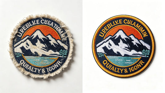
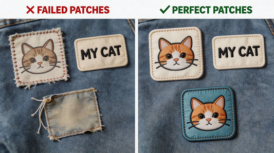
4. Low-Resolution Blurry Artwork Files
Many users provide compressed screenshots, blurred pictures, and low-resolution pixel images for customization. Patch production is a high-precision physical craft. Low-definition artwork will cause jagged edges, distorted patterns, and unclear details after amplification and production, resulting in obvious low-grade texture of finished patches.
Professional Fix
Provide high-resolution original files above 300 DPI, and priority vector files such as AI, PDF, and SVG. Vector files can be infinitely enlarged without distortion, ensuring smooth and neat patch edges and accurate pattern restoration. Avoid screenshots, compressed pictures, and secondary processed blurred images.
5. Ignoring Color Mode & Color Deviation
Most electronic designs adopt RGB color mode, while patch production uses CMYK color calibration standard. Directly using RGB files for production will cause obvious color deviation—bright screen colors turn dark, gorgeous colors fade, and partial color tones distort. In addition, excessive gradient color matching is difficult to restore via patch craftsmanship, resulting in messy color layering.
Professional Fix
Convert artwork to CMYK color mode before delivery, and avoid excessive complex gradient transitions. Use solid color blocking for patch design, with limited and matched color types. Confirm color cards with the factory for high-color-precision customization to reduce visual deviation between screen display and physical patches.

6. Unreasonable Patch Size Proportion
Blindly pursuing oversized or ultra-small patch sizes is a common design error. An overlarge patch will cover too much clothing area, affect wearing comfort, and look bulky; an undersized patch will make core logos and text unrecognizable, losing identification and decorative functions. In addition, mismatched length-width proportions will cause distorted pattern vision.
Professional Fix
Match the size according to the usage scenario: 2-3 inches for hat and collar patches, 3-4 inches for chest logo patches, 4-5 inches for sleeve and backpack decorative patches. Maintain a regular and coordinated length-width ratio, avoid excessive stretching or compression of patterns, and ensure natural and proportional visual effects.
7. Missing Border & Unclosed Edges
Some creative designs pursue borderless effects or have unclosed pattern edges. However, borderless patches are prone to thread fraying, edge warping, and pattern deformation after washing and friction. Unclosed edges will cause irregular cutting in production, seriously affecting the neatness and durability of patches.
Professional Fix
Reserve a complete closed border for all custom patches, adopt merrow border or laser cutting edge sealing technology. The neat border can fix the overall pattern, prevent thread shedding and deformation, and greatly improve the three-dimensional sense and delicacy of the patch.

8. Ignoring Fabric & Background Contrast
Many users only focus on the patch design itself but ignore the matching of patch colors with clothing background colors. Low color contrast will lead to poor patch recognition, making the pattern integrate with the clothes and lose decorative and identification effects. For example, dark patches on dark clothes and light patches on light clothes will appear invisible and dull.
Professional Fix
Improve color contrast between patches and base fabrics. Use bright and contrasting color matching for daily wearing; add outline borders with different colors to separate layers for similar color systems. Ensure the patch pattern can be quickly identified visually and present a distinct hierarchical effect.
9. Too Many Color Types & Chaotic Matching
Stacking too many colors in a single patch is easy to cause color chaos and cluttered vision, losing design sense and grade. Excessive color types will also increase production difficulty, easily cause color deviation in batch production, and raise customization costs unnecessarily.
Professional Fix
Control the color types of a single patch within 4-6 conventional colors. Follow the color matching principle of main color + auxiliary color + decorative color, avoid random color stacking, and maintain unified color tone style. Simple and neat color matching is more in line with high-quality patch aesthetic standards.

10. Neglecting Post-Production & Washing Tolerance
Perfect static design does not mean durable finished products. Some designs with thin lines, hollowed-out gaps, and fragile structures will deform, break, or wear off after washing, friction, and extrusion. Many users only consider the initial visual effect and ignore the durability of the design structure.
Professional Fix
Avoid overly fragile hollow structures and ultra-thin connecting lines in design. Appropriately thicken key lines and strengthen structural integrity. Reserve tolerance for daily washing and friction to ensure the patch can maintain a complete and beautiful state after long-term use and cleaning.
Professional Design Optimization Checklist for Zero-Mistake Customization
To help users quickly optimize artwork and avoid design errors, we sort out a universal patch design self-inspection checklist, covering all core standards:
1. Simplify design elements, retain only core patterns and text, and reserve blank space 2. Font size ≥8pt, line width ≥0.3mm, adopt bold and easy-to-identify fonts 3. Match design style with patch material (embroidery for texture, woven for details, PVC for outdoor) 4. Provide 300DPI+ high-definition vector original files 5. Adopt CMYK color mode, control reasonable color types, avoid excessive gradients 6. Match standard size according to usage scenario with coordinated proportion 7. Complete closed border design with edge sealing treatment 8. High contrast with clothing background color to improve recognition 9. Neat color matching without chaotic stacking 10. Optimize structural robustness to adapt to washing and friction
Pro Tip: Standardized artwork design is the premise of high-quality patches. Optimizing design in advance can avoid rework, save customization costs, and greatly improve the finished grade. When you custom embroidered patches, follow this checklist to complete zero-error artwork production.
Final Thoughts
The quality grade of custom patches is 70% determined by design and 30% by production craftsmanship. Many seemingly trivial design errors will eventually turn into obvious defects of finished patches, such as blurry details, chaotic colors, low recognition, and poor durability. Different from pure digital design, patch customization needs to comprehensively consider craft limitations, material characteristics, size proportion, color restoration, and daily use tolerance.
Avoiding the above 10 common design mistakes can effectively solve most patch customization failures, making the finished patches clear in details, hierarchical in vision, durable in use, and high-end in texture. Whether for personal DIY decoration or team commercial batch customization, standardized design optimization is the key to maximizing customization value and obtaining satisfactory patch works.
Excellent patch design balances beauty and practicality, vision and durability. Mastering professional design rules will make every custom patch delicate, neat, and long-lasting. Choose professional customization and standardized artwork design to create high-quality exclusive custom patches.
FAQ
Q:Why do my custom patches look blurry after production?
A:Blurry patches are mainly caused by low-resolution artwork, too small fonts, ultra-fine lines, and overcrowded design details. These elements cannot be fully restored by patch craftsmanship, resulting in blurred and messy finished details. Providing high-definition vector files and simplifying complex details can perfectly solve this problem. High-quality custom embroidered patches with optimized design present ultra-clear details.
Q:What is the best font size for custom patch design?
A:For most conventional patches, the font size should not be less than 8pt. Too small fonts will stick together and become unrecognizable after production. It is recommended to use bold sans-serif fonts with neat strokes and high recognition, avoiding complex slender serif fonts.
Q:Can gradient colors be used for custom patches?
A:It is not recommended. Embroidery, weaving, and PVC molding crafts have limited gradient restoration capabilities. Excessive color gradients are prone to color deviation and messy layering. Solid color blocking matching is the most stable and high-grade choice for patch design.
Q:Do I need a border for custom patches?
A:Yes, a closed border is necessary. A complete merrow or laser border can fix the patch structure, prevent thread fraying and edge deformation, improve overall neatness, and extend service life. Borderless patches are prone to damage during washing and friction.
Q:What file format is best for patch customization?
A:Vector files such as AI, SVG, and PDF are the best choices, with 300DPI or higher resolution. These files can be infinitely enlarged without distortion, ensuring ultra-clear and smooth patch details and edges. Avoid compressed screenshots and low-resolution pixel pictures.
Tags:
Previous
Bulk Custom Patches Ordering Guide: Cost, Quality & Lead Time Tips (2026)
Next
Patch Backing Guide: Iron-On vs Sew-On vs Velcro vs Peel-Stick (2026)